With Project 1 following the philosophy of new formalism photography, I decided to try and expand upon these ideas and include them within my own practice. By doing this, I first needed to better my understanding of what exactly new formalism is. I delved into the magazines Toilet Paper, and Conscientious, both of which I was introduced to briefly within lectures/workshops. I also looked into a few other websites and photography projects too, to examine the images and see what exactly is classified as ‘new formalism’.
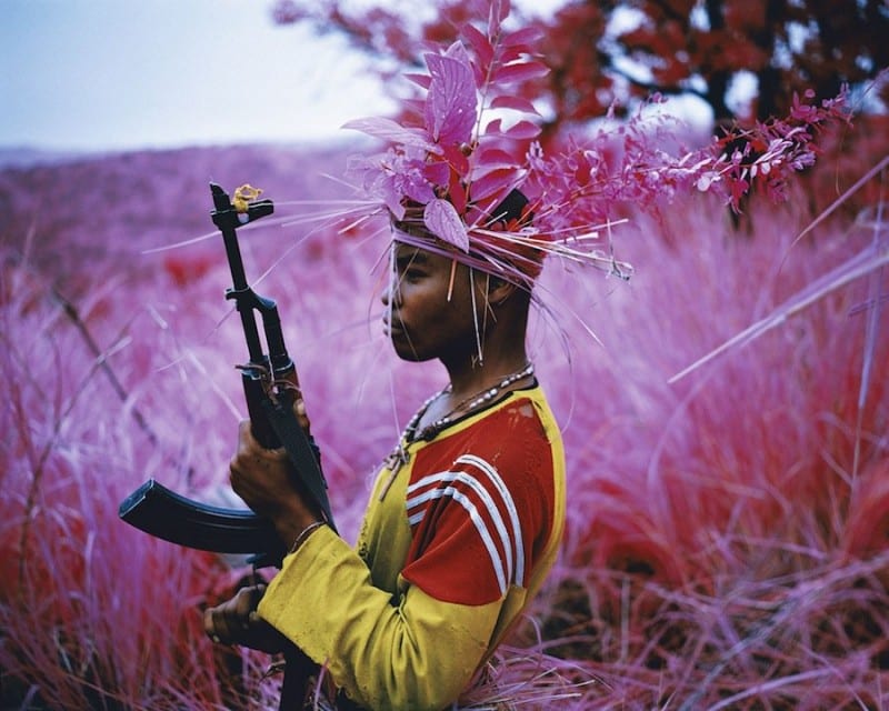
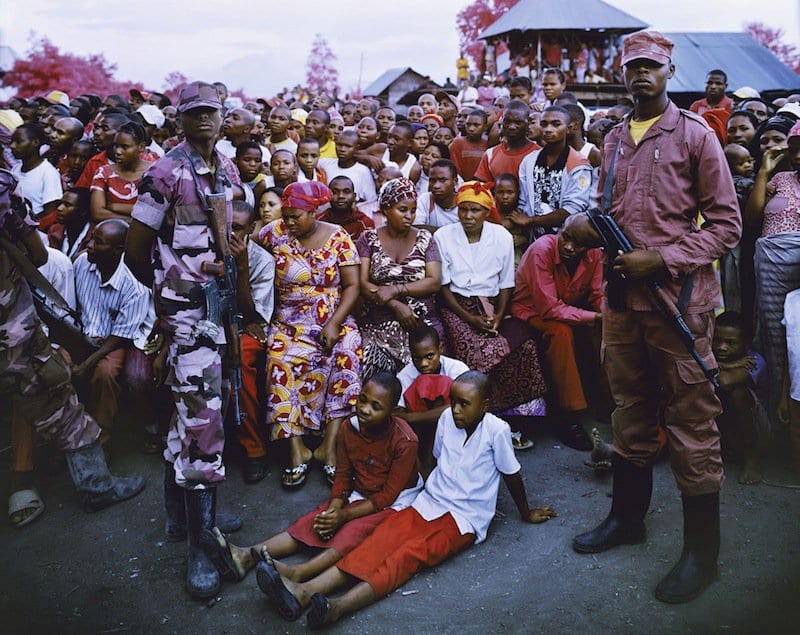
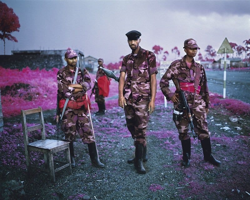
One very interesting project that I found is Richard Mosse‘s The Enclave. Using Kodak Aerochrome film developed for the military in the 1940s, Mosse travelled to Congo to photograph the landscapes and the local people. The benefit of using this film type is that greens are transformed into shades of pink and red, making the images look much less serious and in this case, more comical. The trees and grass are a beautiful shade of red and the soldiers wearing their army uniforms have a pink camouflage design. What I love about these images is the complete juxtaposition of the use of pink, a colour often connoted with femininity, which completely destroys any intimidating value that originally existed. The pink entirely redesigns the image and the soldiers immediately appear to be more ‘camp’, an outlook that would never have been visible without the use of this film type.
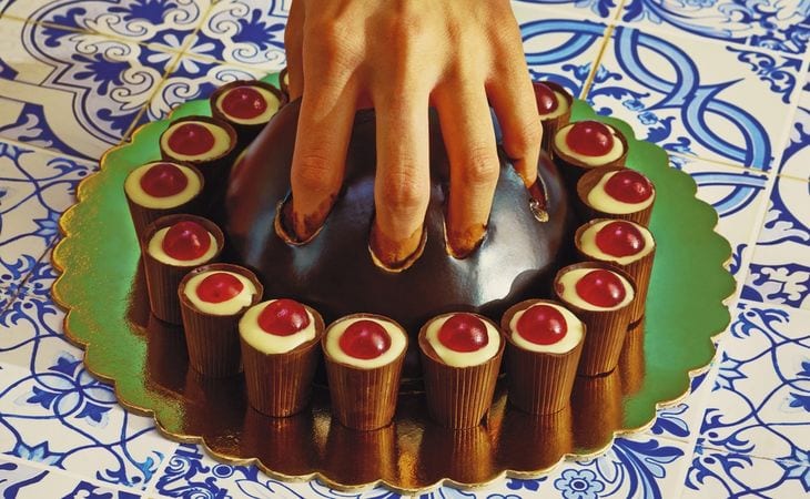
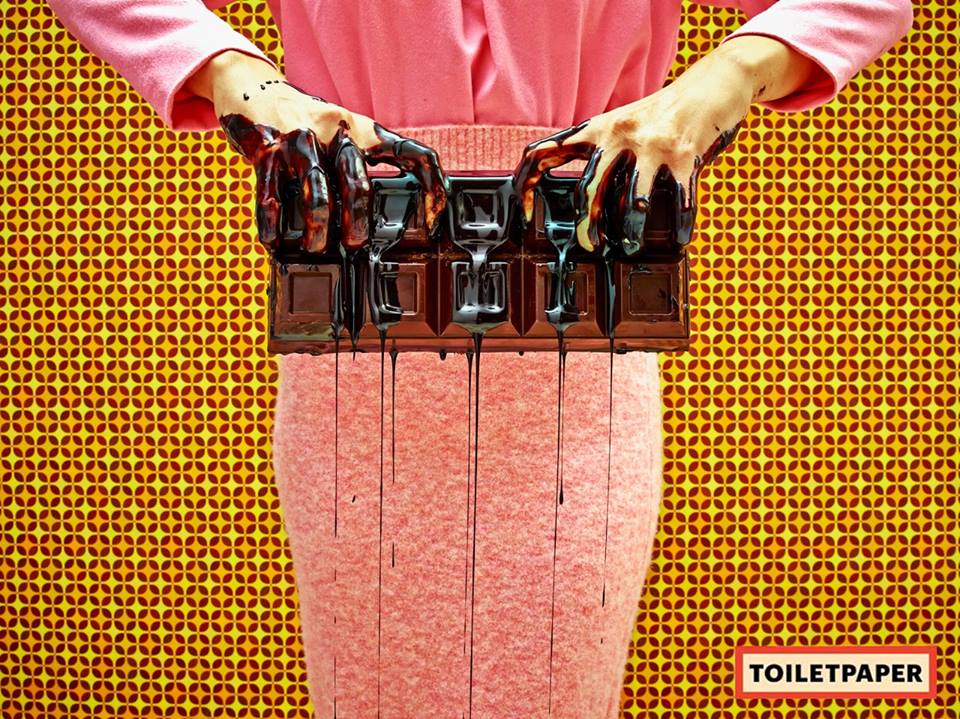
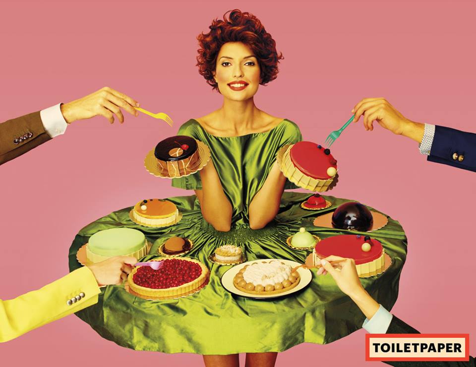
The definition of Formalism within art history is the study of art by analysing and comparing form and style – the ways that different objects are made and their pure visual aspects. Formalism emphasises compositional and perceptual elements as opposed to iconography or historical/social context. It is very clear that New Formalism photography follows these guidelines, which is exemplified in the images above. Within the magazine Toilet Paper the photographs are a lot less comical, however much more surreal and any person within the images is drastically dehumanised, and presented merely as an object. I really admire this approach to subject photography, as it toys with commercial photography and discards the idea of the subject being central and crucial to the image’s success.
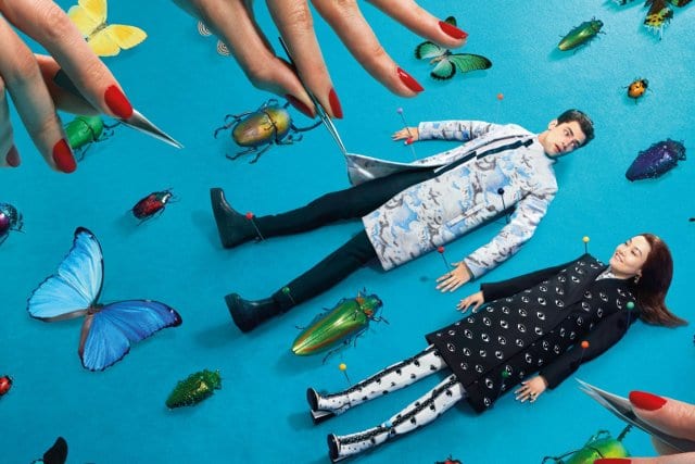
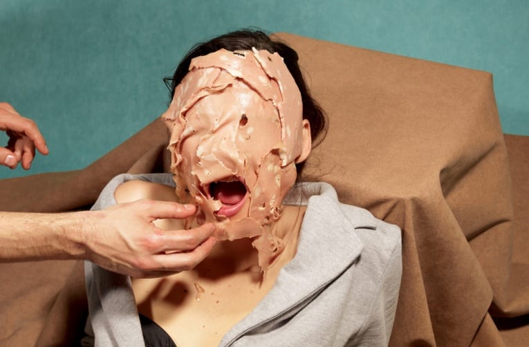
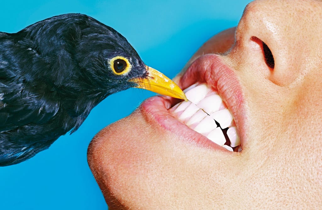
Within the first image, the subjects (although clearly showing some humanity) are compared to dead bugs, as if they were part of the collection. Whereas in the other two images the subjects have been completely dehumanised and are completely useful only as objects. I really love this style of photography, and it’s surreal elements really commence an initial reaction of “that’s weird”, however, I don’t just want the audience of my images to have that single reaction, I want to trigger more of a response. So bearing this style in mind, I looked further into Toilet Paper, and focused more on images of food, as my ideas were starting to develop more specifically.
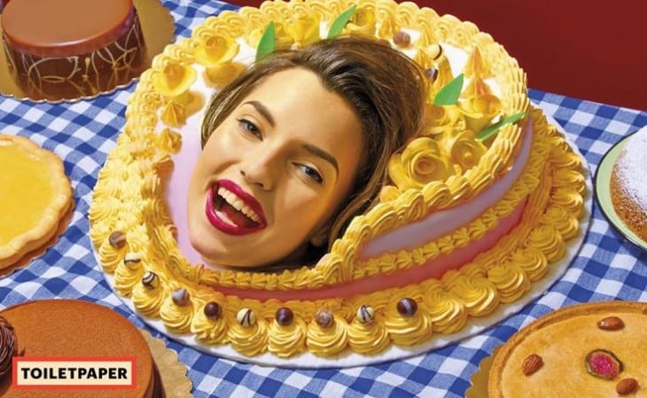
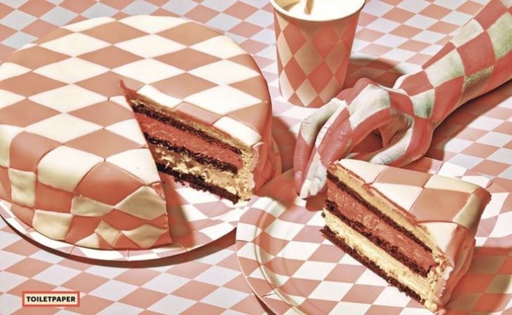
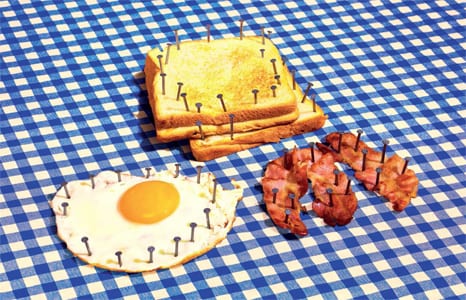
These photographs take on a very 1960s esc style; not only through the subjects’ outfits, but through the colours and general tone of the image too – they really display old fashioned characteristics. What I love most about these photographs is the juxtaposition between modernity and classicism. For example, in the first image displayed you see a beautiful cake, decorated in a very smart, delicate, yet classic manner placed on a typical checkered table cloth. Both the content and technical production of this image would lead you to believe that is from the previous century, however with the addition of a subject in such a way as shown, it portrays a very modern, abstract style. I truly admire the disruption of the perfect presentation of the food, as shown in images 1, 3 and 4. The two major opposites of beauty and destruction clash impeccably in my opinion, which lead me to further research and inspiration. I decided to focus more on the destruction of beautifully crafted food, however instead of it being damaged by subjects; by objects instead.
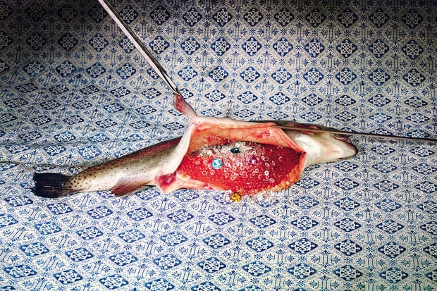
These were unfortunately the only two images that I could find, as I couldn’t get my hand on a physical copy of Toilet Paper, and due to this there is also a lack of images on the web. However these images have still given me great ideas to what I hope to achieve. Going back to the previous paragraph about the destruction of food, I really admire how inedible objects are ruining otherwise edible food (despite the uncooked fish). This got me thinking a lot about commercial food photography and the disappointment when actually ordering food and thinking “that’s not what it looked like on the picture”, a common issue that I am sure that I am not exclusive to noticing. This also related back to the images of beautifully presented food being ruined and looking completely unappealing. I therefore decided to set my sights on a final idea, and that is to create mock images of commercial food photography. What I will be attempting to do is to recreate commercial food adverts however either with the addition of inedible objects or aesthetically unappealing variants of the authentic ingredients. I want to add a comical edge to my images whilst also incorporating the colourful, attractive style of new formalism photography, which will work in beautiful contrast with the un-aesthetic meals.
I decided to research into commercial food photography to develop a better insight for the stylistic approaches used. I want to recreate the images by copying the colour schemes and psychological effects that make the audience more attracted to the food, and then juxtapose this with my own, unappealing presentation of the food itself. To do this I first had to look into colour meaning and the subliminal messages that certain colours send to our brain. Now whilst subliminal advertising works primarily in video form, the messages that fonts, colours and the composition of a photograph send to our brain are essential in commercial food adverts, as we need to feel an urge for hunger that makes us buy that particular product.
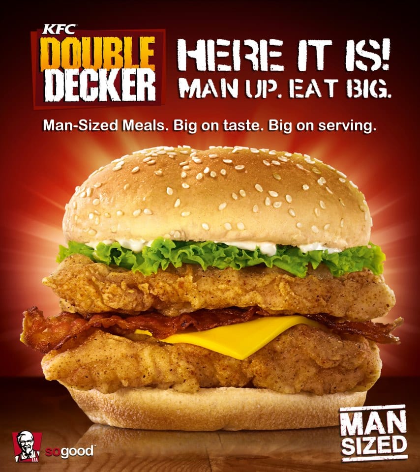

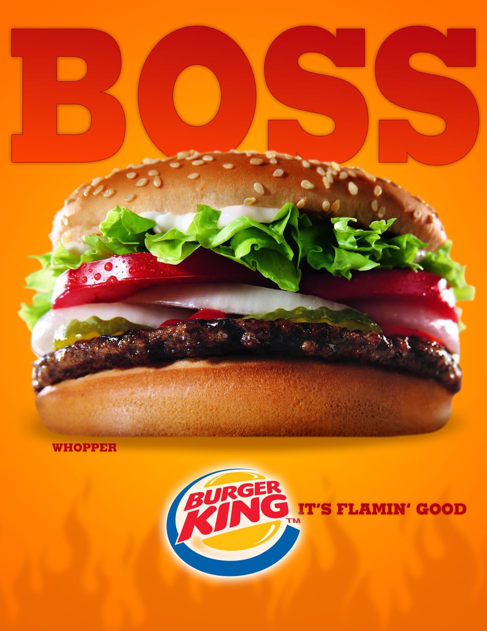
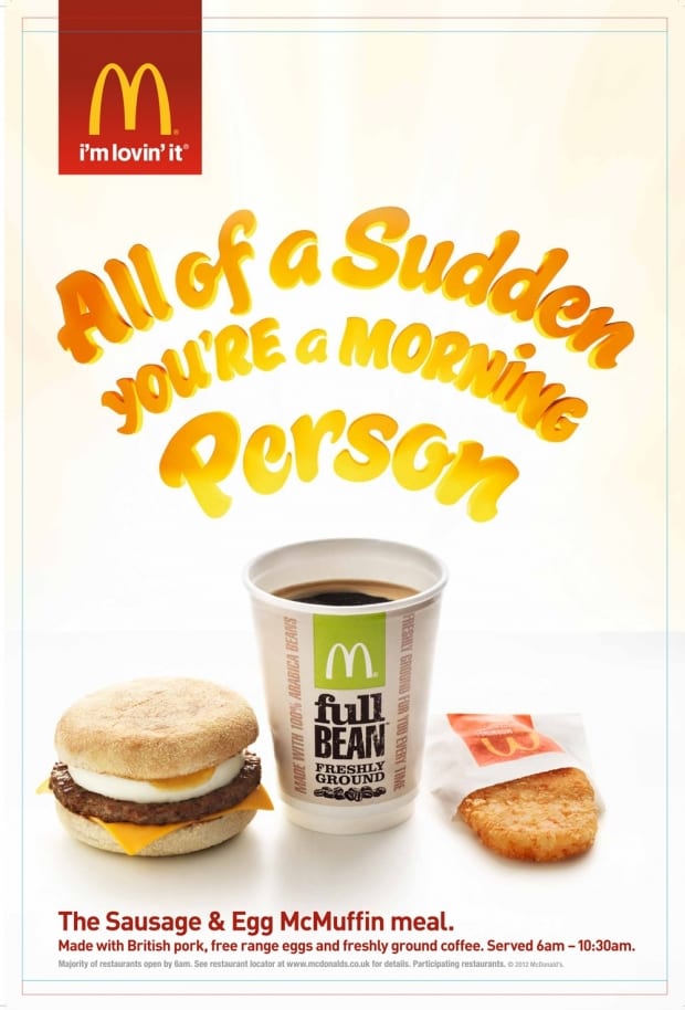
Looking at the food posters above, the predominant colour in the posters is either red or orange. Red is associated with warmth and energy, something which all of these foods provide. It is also associated with excitement, masculinity and physicality. Results from a questionnaire showed that a significantly higher 84% of men ate at a fast food restaurant at least once per week, compared to only 58% of women, so the use of the colour red is to appeal more to the restaurants’ primary demographic. Orange, like red, also connotes a feeling of warmth, however more importantly it provides physical comfort. I think this is a really important element as many people who are sad will comfort eat, and orange is furthermore inviting them to do so. I feel that from these posters, warmth is the most important feeling presented by colour, as warmth is associated with love, laughter and even physical warmth in the form of holidays, all of which provide happiness. By connoting happiness through such specific colours the adverts manipulate your mindset and convince you that eating this food will make you happy.
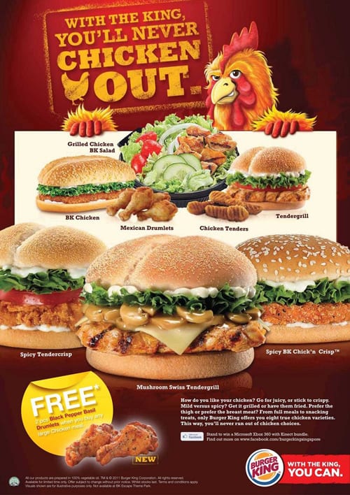
In the final poster, white is the dominant colour as opposed to red or orange. I personally think this is a very clever poster, as not only does it differentiate from the others in forms of aesthetics, it makes you feel a different way too. Now the colour white is associated with sophistication, efficiency and purity, all of which provide a very different feel compared to red or orange. This is because the poster is advertising breakfast, and is therefore appealing to a different audience. (Typically speaking) Lazy people sleep in and miss breakfast, whereas sophisticated and efficient people are always awake early and therefore possess the need for food in the morning. The poster targets these individuals by it’s use of white, as opposed to red or orange.
After studying colour within adverts I feel it is important to also take note of the presentation of food, despite the fact that I will be mocking it. Looking at the images above, each item of food is precisely placed in the right location, and perfect samples of each item are sourced – meaning the best burgers, lettuces and tomatoes are chosen in order to increase the aesthetic value of each item of food. I will mock this ‘idealised’ placement of food by not representing the caution that is otherwise shown. I looked into a behind the scenes McDonald’s photo shoot to get a better insight to how exactly the professionals do it. The results were very interesting, as the amount of care and detail shown in both production and post production is exceptional.
PREPARING FOR PRODUCTION
For my final photographs I will be creating three separate images, so I will not be compiling more than one item of food into each photo, I want to focus on one at a time. I have decided to focus on burgers, simply as they are one of the primary images identified with fast food, and also because they will be easy to manipulate. The style that I have decided to stick with is using both inedible and incompatible yet edible items, and using these as toppings for the burger. Below is a list of some of the items I am planning on involving within each burger.
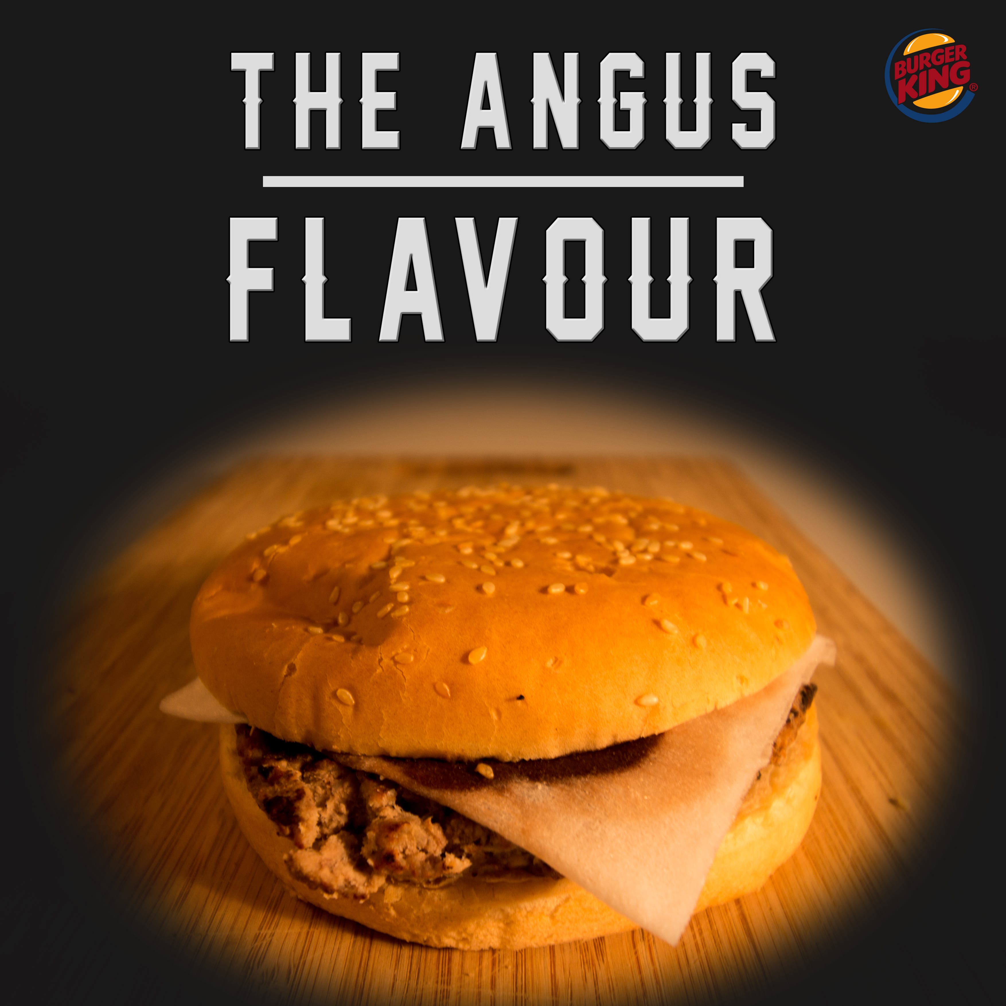
Burger 1.
Beef burger – regular burger with indentations to look less appealable
Slice of cheese – dirty baby wipe
Sauce – chocolate milkshake to replicate the bbq sauce.
Bread – sesame seed with indentations
Background – chopping board
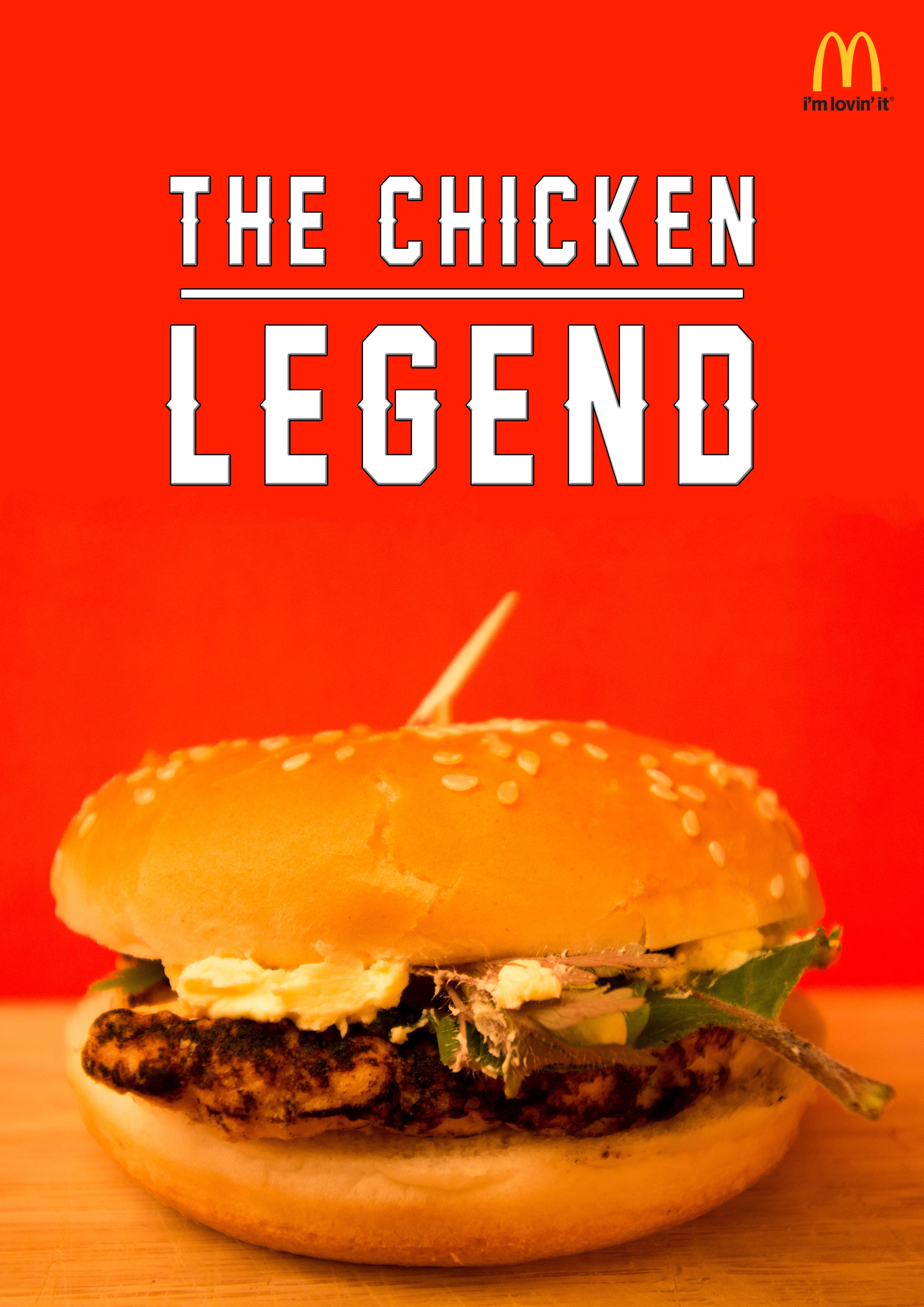
Burger 2.
Chicken burger – regular piece of chicken with indentations
Salad – grass and leaves
Traditional stick going through the burger – broken, used toothpick
Sauce – margarine
Bread – regular with indentation
Background – red card
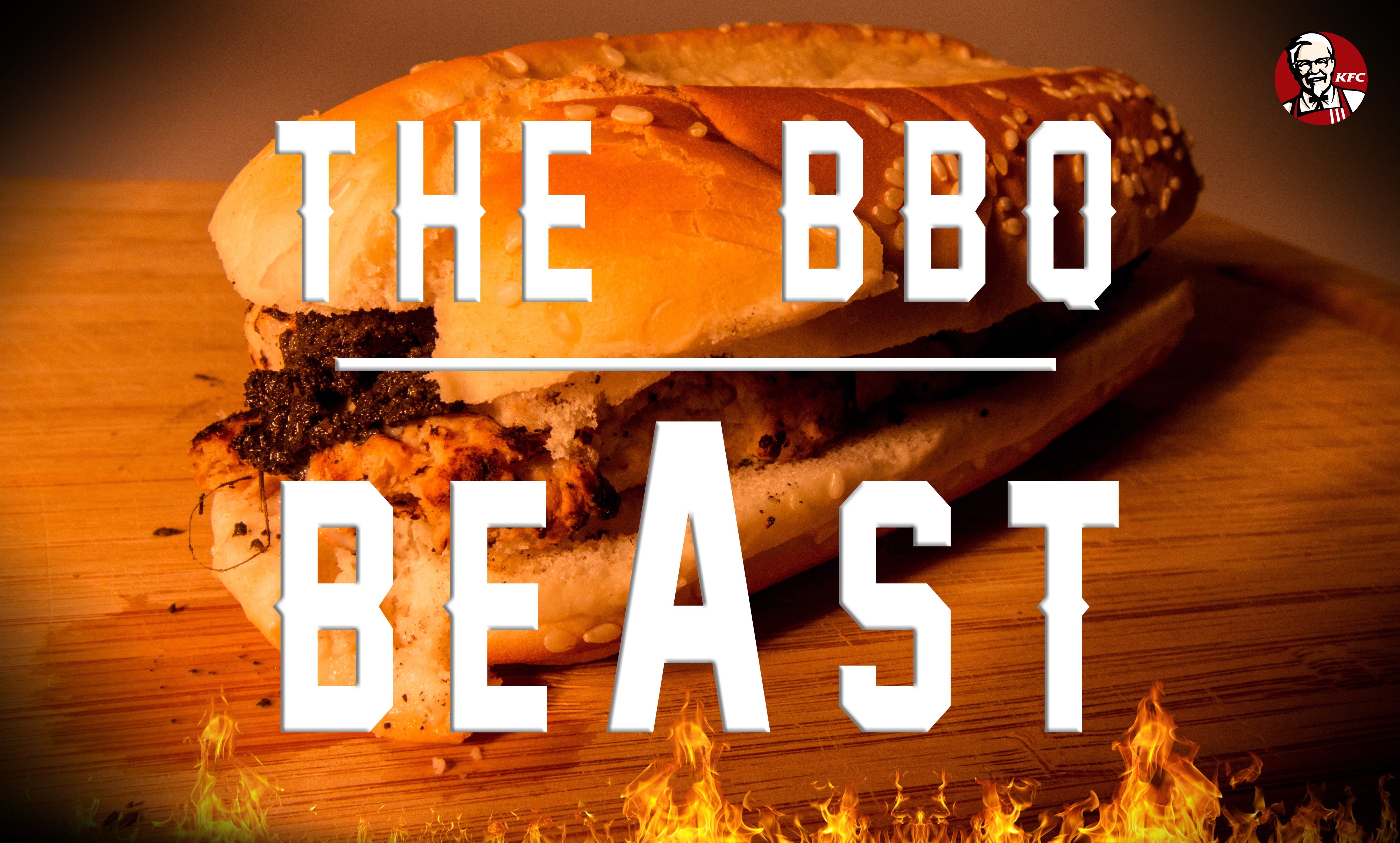
Burger 3.
Beef burger – regular burger with indentations
Sauce – bleach
Seasoning – soil
Bread – sesame seed with indentations
Background – orange card
As I am fairly new to lighting, I will be experimenting in the studio, and I don’t have an exact idea of what I hope to achieve. I will be using either one or two flashes, or the LEDs, however like I said, it will all be an experiment.
Lens wise, I am not sure what to use. A wide angle lens will give the impression that the burger is larger, however it will include more of the background, and I am focusing on either using A4 card or the backdrop, so this will not help. Whereas, a macros lens will allow the detail of the food to blossom, also improving it’s appealability. I will take both types of lenses into the studio with me to allow for experimentation – I have a whole two hours and I intend to make the most of this time.
PRODUCTION ISSUES AND THE NEXT STEPS
As I previously explained, I wanted to experiment with lighting in the studio, however I didn’t know that my camera required a shoe cord. So, once in the studio with limited time and everything set up, I had to use the modelling lights and LEDs for my lighting source which effected my work dramatically. I still feel that I have photographed the burgers with the correct proportions to make them look bigger, and I also think I have positioned all the topping onto the food correctly, so that they are visible to the audience.
My main problem like I said is the lighting, but other than that there were no other main issues. All I need to do now is add some text on Photoshop, and change the images into a poster. Using the plans that I laid out previously I want to make the food look as appealable and as similar to real food adverts as possible, and if I can do that, then I will be very happy with the quality of my work.
FINAL IMAGES