After undertaking some reading and looking at some examples of photographic typology, I have reached the understanding that it is essentially photographs that are the same, but different. By this I mean the subjects/objects being portrayed are very similar, but there is always a slight difference between them all – this could be composition, the object being photographed, the surrounding area and so on. Before I start to develop some ideas, I want to take a look at other typology photography, to gather a few ideas and to also discover what makes the series of images so interesting.
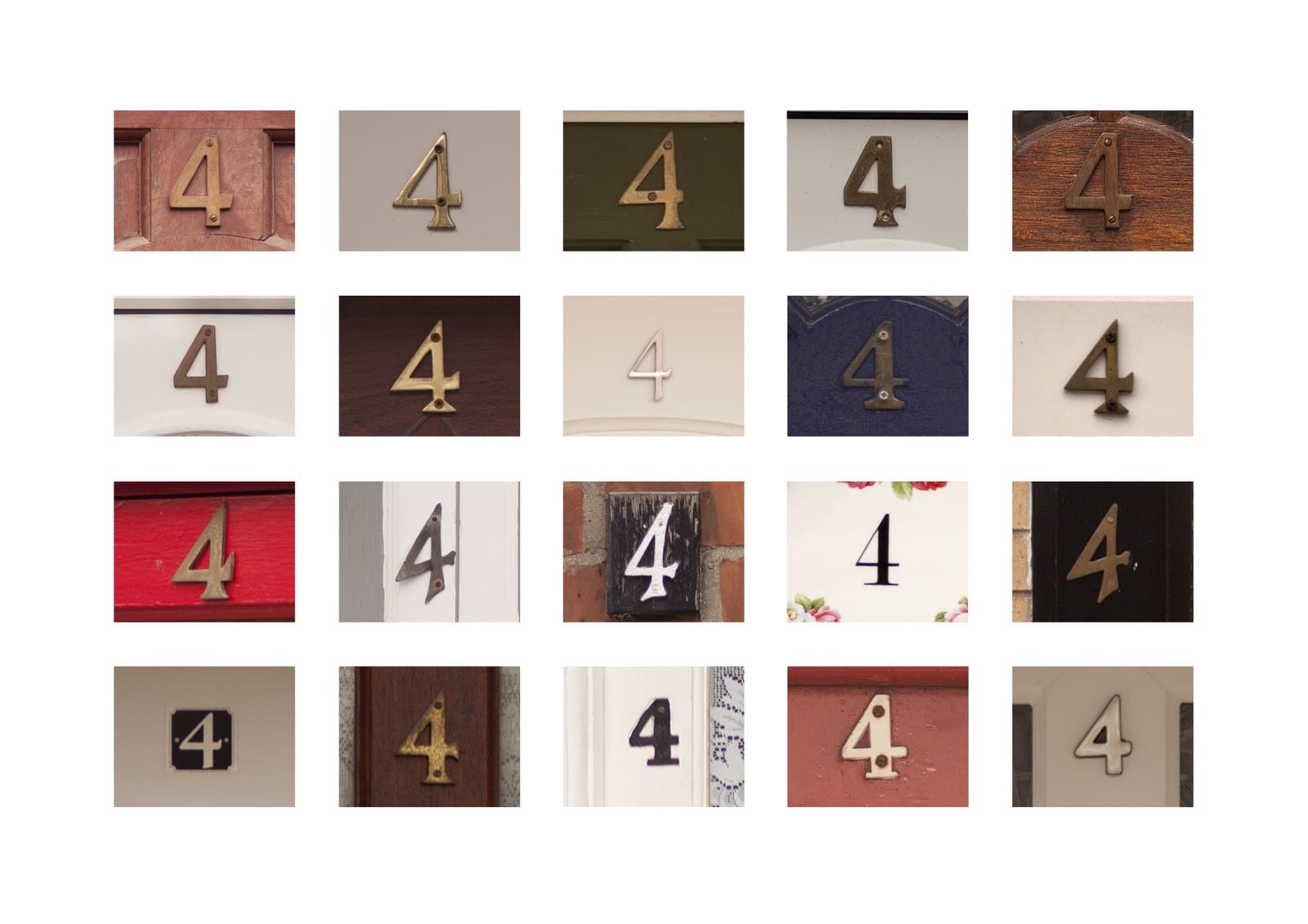
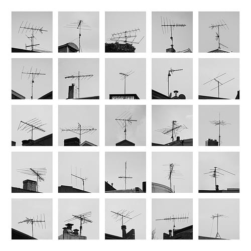
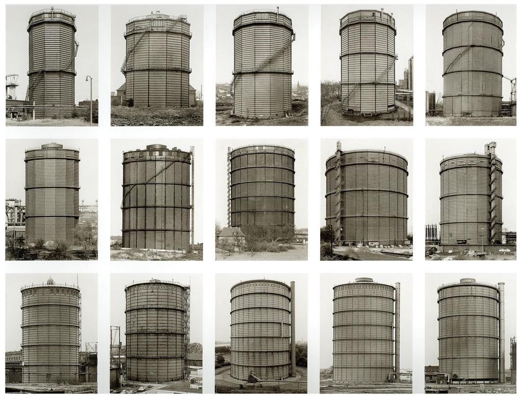
As you can see from the images above, there is always certain similarities/something that is the same, within each photograph, but there are slight changes making them work together superbly. I really love the picture of the TV aerials, as the primary thing that changes within each image is the composition. I think this really makes each image stand out from one another, whereas in the other photos, each individual image looks too similar for my liking. I definitely want to adopt this method within my own set of images, as I just feel it looks the most interesting.
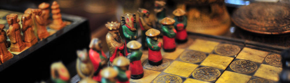
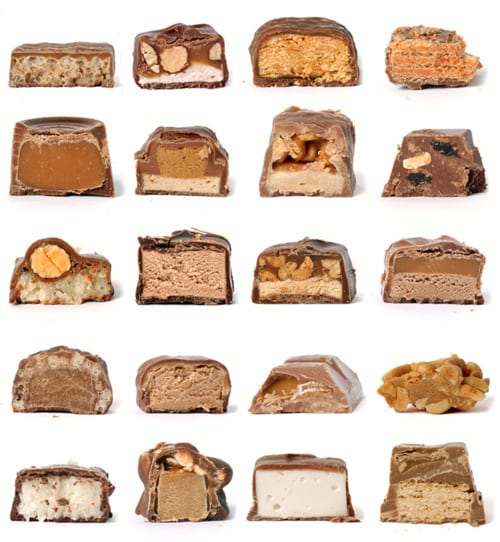
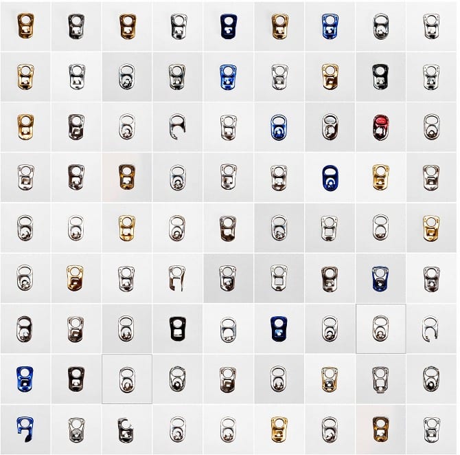
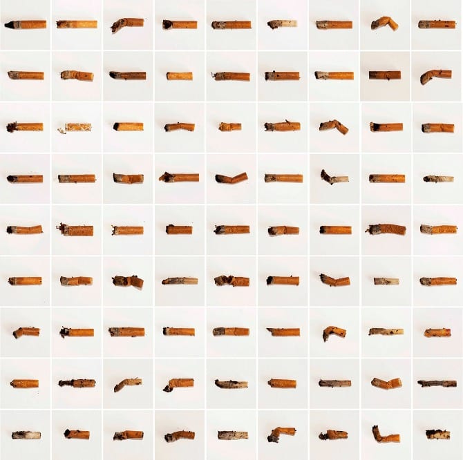
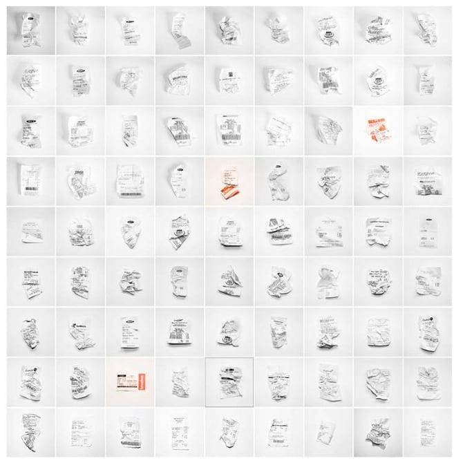
To gather some more information, I looked on photographer Steve Tyler‘s website. He puts a lot of focus into typology, and some of his concepts are really interesting. The following pieces of work emphasise how much waste humans in more economically developed countries actually produce. He includes items that we deem as insignificant, yet we don’t appreciate the value and importance of how fortunate we are to be able to use said items. This concept fits in with my second project, and is something I feel very strongly about.
Now as interesting as I find this work, I really don’t want to incorporate the same ideas within two different projects, I would like to experiment in different ways. However, looking at Tyler’s images has diverted my thoughts from the identity of individuals, to the identity of a city. I began thinking to myself about the differences and similarities between Lincoln and other cities, and the first thing that popped to mind is the Victorian style that the majority of the city adheres to. Now my first idea was to photograph the cobbled pavements and create a huge grid with all of these images in, however I feel that this portrays Lincoln as old-fashioned and not modern, which is not a style that I particularly deem as a positive. Instead I wanted something that portrays both Lincoln’s old styles with it’s new, in a converging manner.
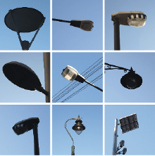
I found this image, and despite it’s lack of detail, it gave me the inspiration to photograph lamps/lampposts within Lincoln. Up towards the top of the cathedral there are lots of old fashioned lamps and obviously towards the bottom of the city, it becomes more modern with typical lampposts. I think it would be really cool to portray the difference between technology and contrast how Lincoln essentially has the best of both worlds. Not only this, I feel it is very important to emphasise Lincoln’s cultural background, as both of these contrasting styles interest different audiences.
PREPARING FOR PRODUCTION
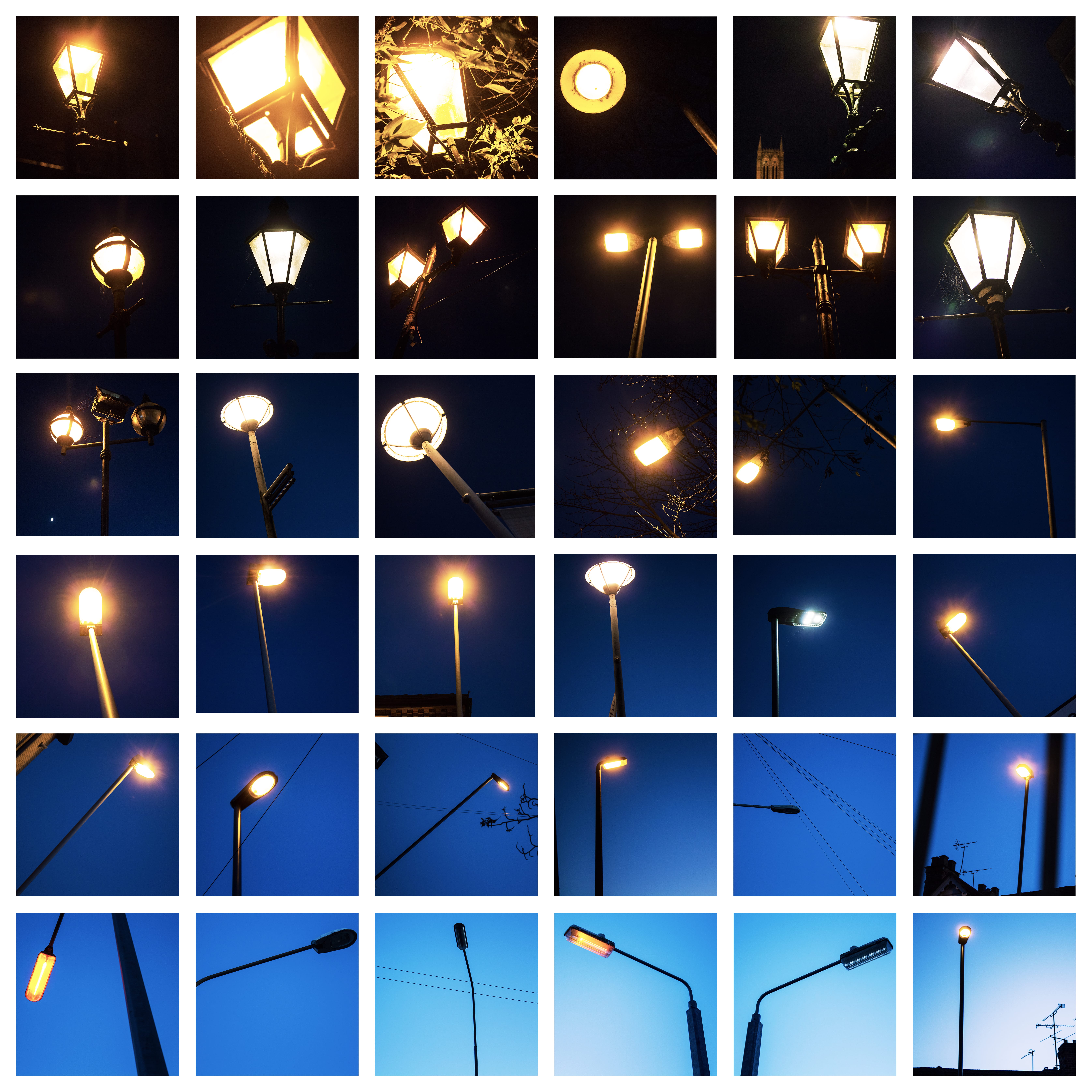
As for this project I have to produce a series of images, opposed to a minimum of three, I intend to (obviously) shoot all of my photographs outdoors. However, I don’t just want to photograph these lights during the day. I think it would be really cool to photograph the lampposts during the evening, whilst it is still bright, and then as the sun starts to set, I will photograph some other lights, eventually leading onto the more Victorian styled lamps, when they are switched on and the sky is black. I will then portray these images backwards, starting with the darker images in the up-most left, and then proceeding to get lighter and lighter within each image, finishing with a lamppost during daylight in the bottom right. Not only will this give the reader more information to take in, I also think it gives more of a story, as there will be a typical left to right book reading style that will show the transition between the lighting changes.
I want to use natural light for all of my images as this will work much better with the style I am hoping to create.
FINAL IMAGES
I really enjoyed creating my final images, and I think they went really well. I originally aimed to create a 9×9 grid with 81 images, however there would have been too many images and it would have been too difficult to edit. Instead I decided to create a 6×6 grid, and I feel this paid off. When shooting I also tried to alter the composition as frequently as I could, given that the ‘subject’ would be similar in all the photographs, so I wanted to try and add in many different types of images as possible.