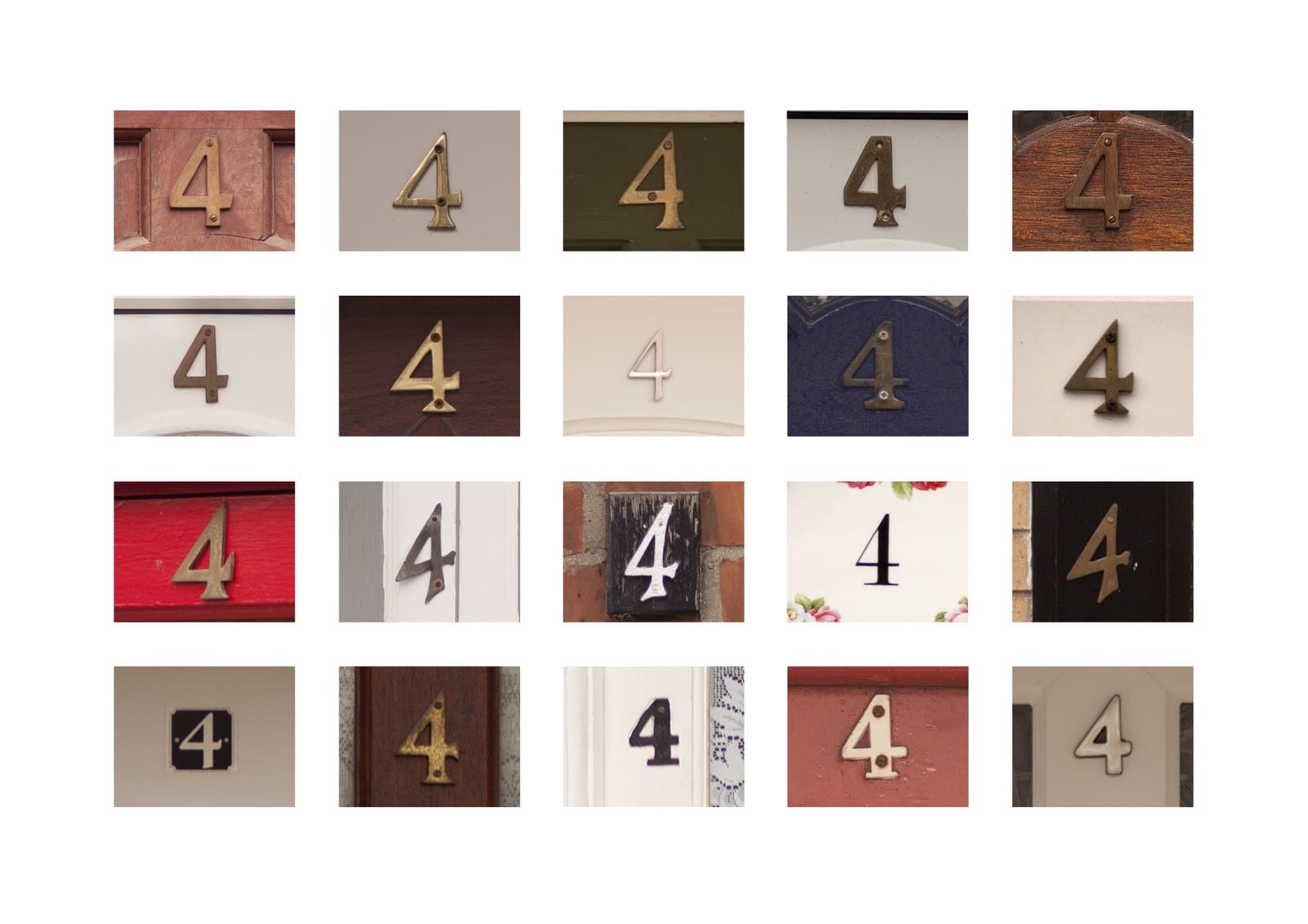
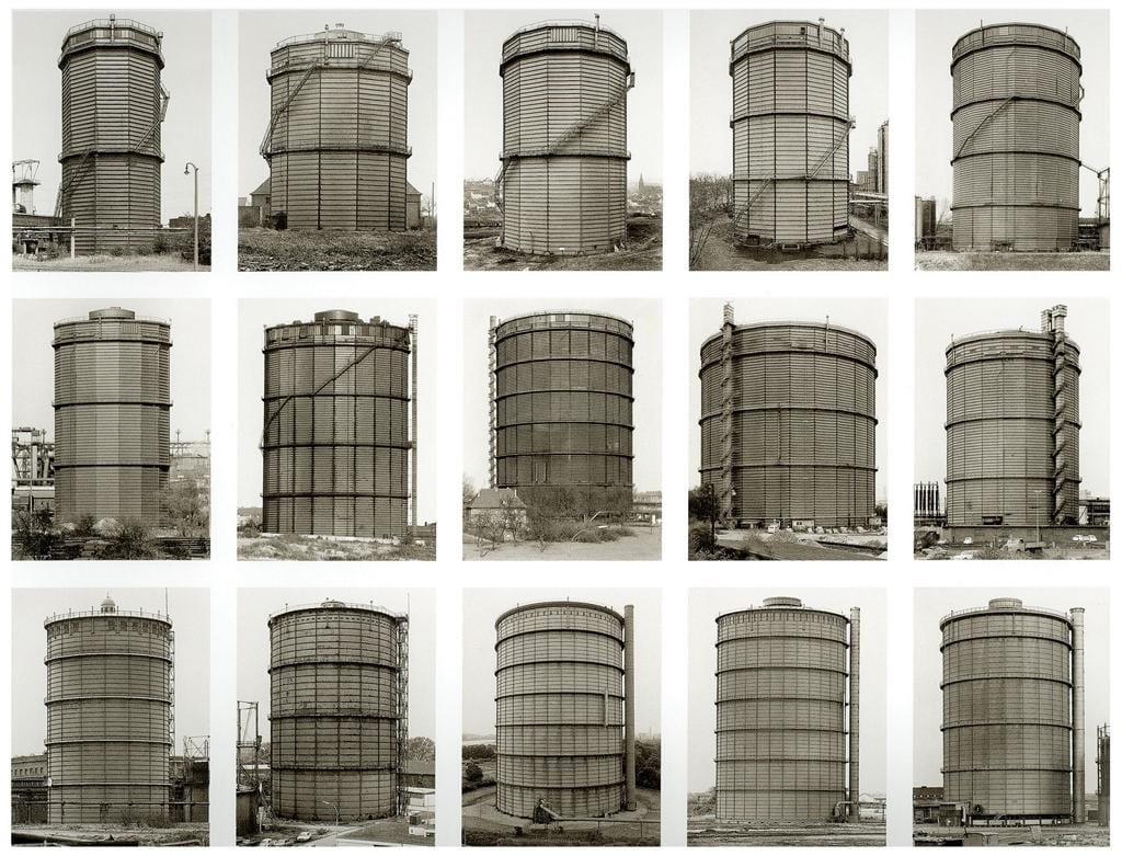
After undertaking some reading and looking at some examples of photographic typology, I have reached the understanding that it is essentially photographs that are the same, but different. By this I mean the subjects/objects being portrayed are very similar, but there is always a slight difference between them all – this could be composition, the object being photographed, the surrounding area and so on. Before I start to develop some ideas, I want to take a look at other typology photography, to gather a few ideas and to also discover what makes the series of images so interesting.
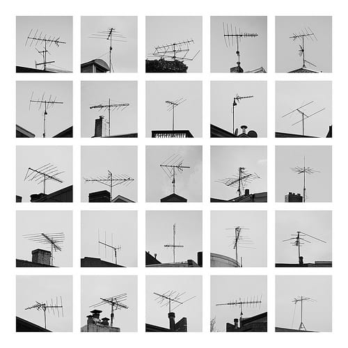
As you can see from the images above, there is always certain similarities/something that is the same, within each photograph, but there are slight changes making them work together superbly. I really love the picture of the TV aerials, as the primary thing that changes within each image is the composition. I think this really makes each image stand out from one another, whereas in the other photos, each individual image looks too similar for my liking. I definitely want to adopt this method within my own set of images, as I just feel it looks the most interesting.
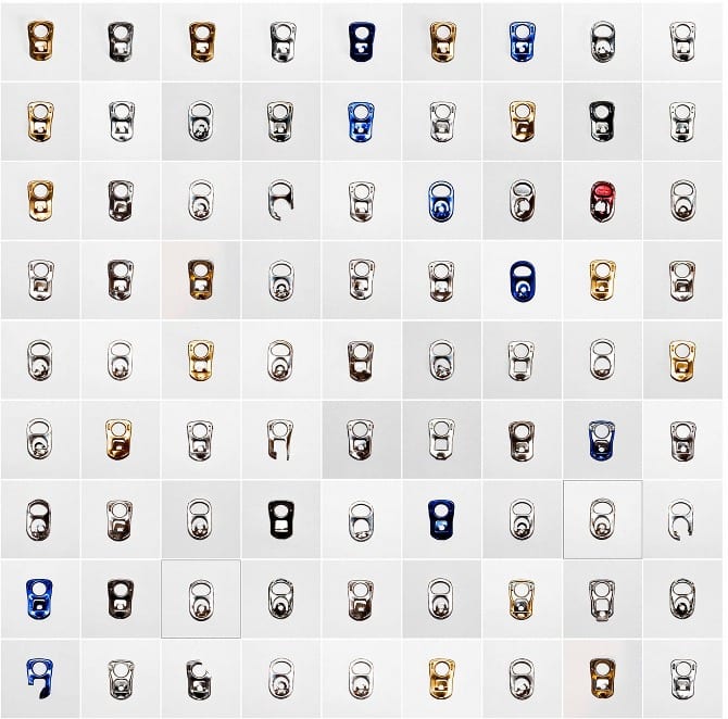
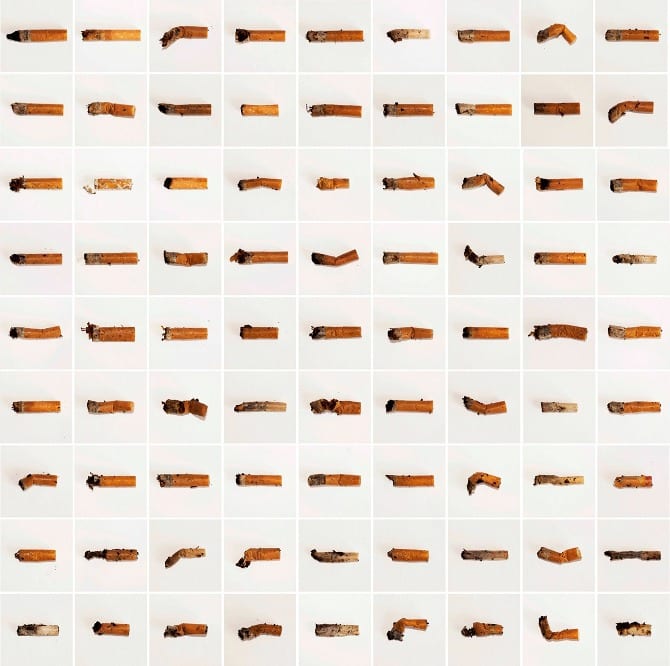
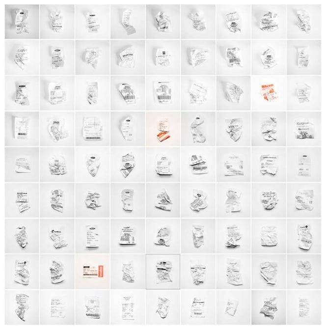
To gather some more information, I looked on photographer Steve Tyler‘s website. He puts a lot of focus into typology, and some of his concepts are really interesting. The following pieces of work emphasise how much waste humans in more economically developed countries actually produce. He includes items that we deem as insignificant, yet we don’t appreciate the value and importance of how fortunate we are to be able to use said items. This concept fits in with my second project, and is something I feel very strongly about.
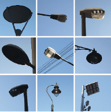
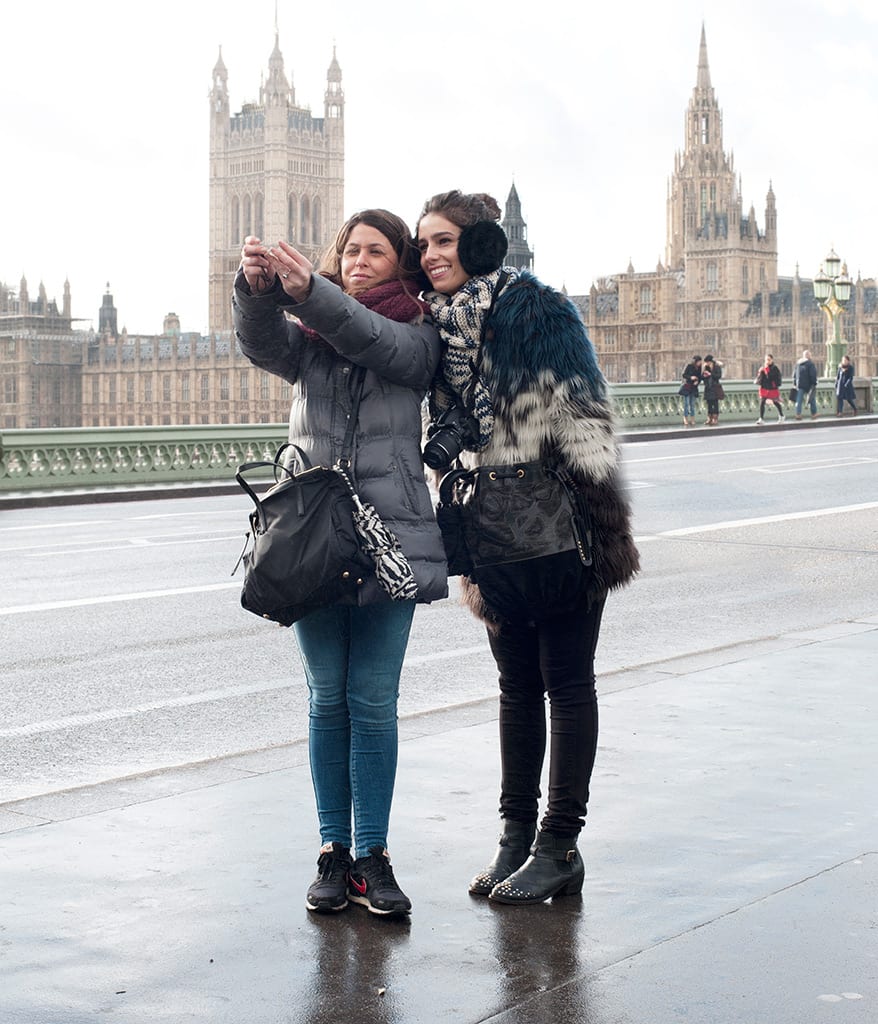
Now as interesting as I find this work, I really don’t want to incorporate the same ideas within two different projects, I would like to experiment in different ways. However, looking at Tyler’s images has diverted my thoughts from the identity of individuals, to the identity of a city. I began thinking to myself about the differences and similarities between Lincoln and other cities, and the first thing that popped to mind is the Victorian style that the majority of the city adheres to. Now my first idea was to photograph the cobbled pavements and create a huge grid with all of these images in, however I feel that this portrays Lincoln as old-fashioned and not modern, which is not a style that I particularly deem as a positive. Instead I wanted something that portrays both Lincoln’s old styles with it’s new, in a converging manner.
I found this image, and despite it’s lack of detail, it gave me the inspiration to photograph lamps/lampposts within Lincoln. Up towards the top of the cathedral there are lots of old fashioned lamps and obviously towards the bottom of the city, it becomes more modern with typical lampposts. I think it would be really cool to portray the difference between technology and contrast how Lincoln essentially has the best of both worlds. Not only this, I feel it is very important to emphasise Lincoln’s cultural background, as both of these contrasting styles interest different audiences.
PREPARING FOR PRODUCTION
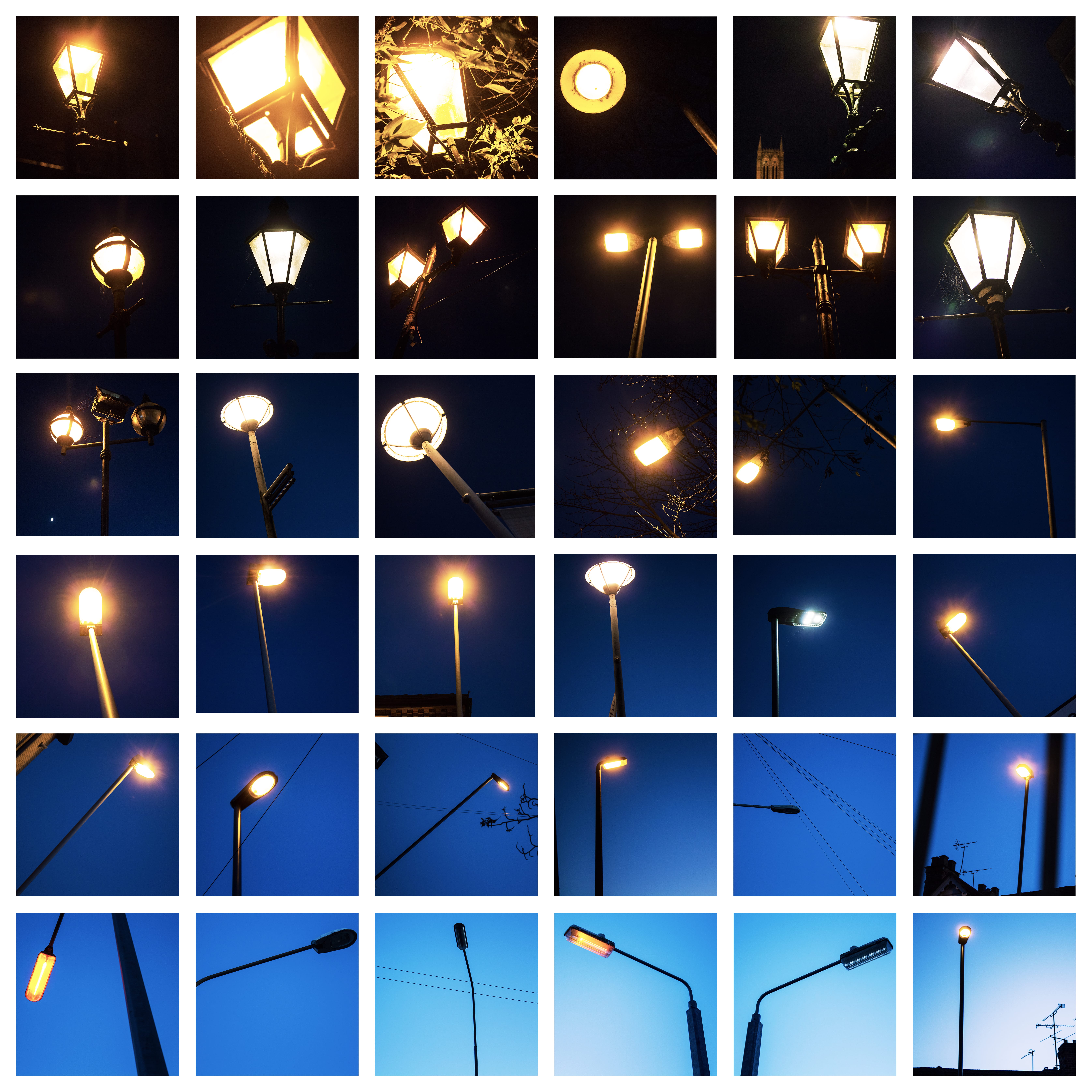
As for this project I have to produce a series of images, opposed to a minimum of three, I intend to (obviously) shoot all of my photographs outdoors. However, I don’t just want to photograph these lights during the day. I think it would be really cool to photograph the lampposts during the evening, whilst it is still bright, and then as the sun starts to set, I will photograph some other lights, eventually leading onto the more Victorian styled lamps, when they are switched on and the sky is black. I will then portray these images backwards, starting with the darker images in the up-most left, and then proceeding to get lighter and lighter within each image, finishing with a lamppost during daylight in the bottom right. Not only will this give the reader more information to take in, I also think it gives more of a story, as there will be a typical left to right book reading style that will show the transition between the lighting changes.
I want to use natural light for all of my images as this will work much better with the style I am hoping to create.
FINAL IMAGES
I really enjoyed creating my final images, and I think they went really well. I originally aimed to create a 9×9 grid with 81 images, however there would have been too many images and it would have been too difficult to edit. Instead I decided to create a 6×6 grid, and I feel this paid off. When shooting I also tried to alter the composition as frequently as I could, given that the ‘subject’ would be similar in all the photographs, so I wanted to try and add in many different types of images as possible.
This project in my opinion allows the most creativity and therefore is the most exciting project that we have been handed. I am really looking forward to experimenting with different types of portraiture, as I want to create a variation of images. This is something we have not been given the opportunity to do in the other projects, as the images have all had to be similar, or based within the studio, however with the brief being as broad as “produce 3 portraits,” it really gives me a lot of ideas for experimentation.
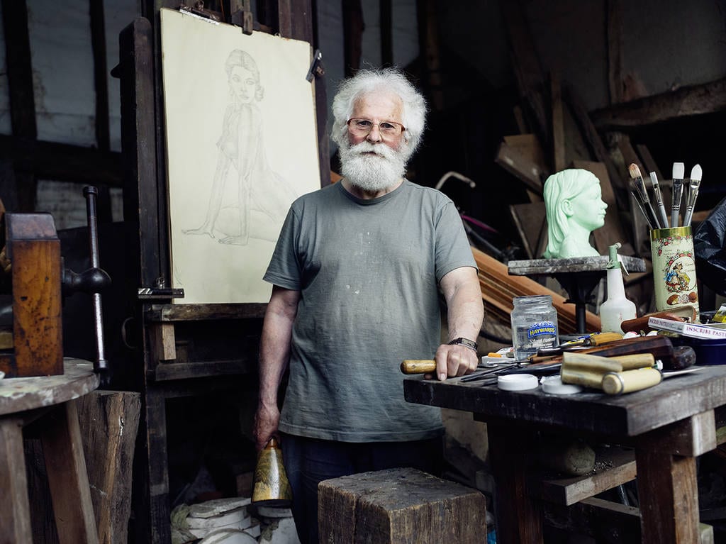
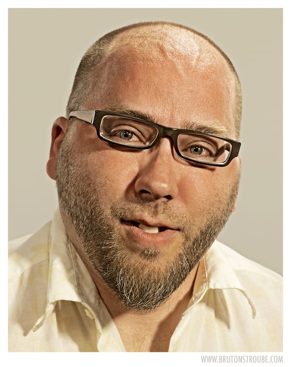
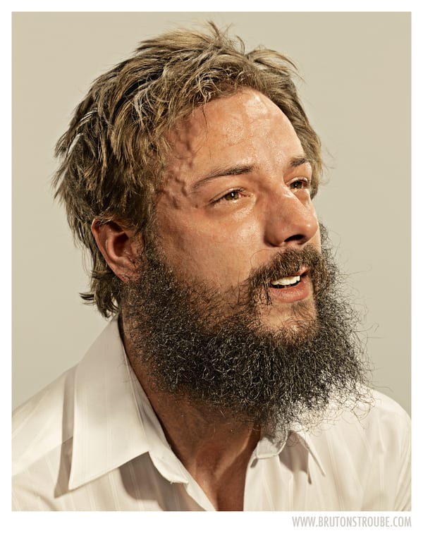
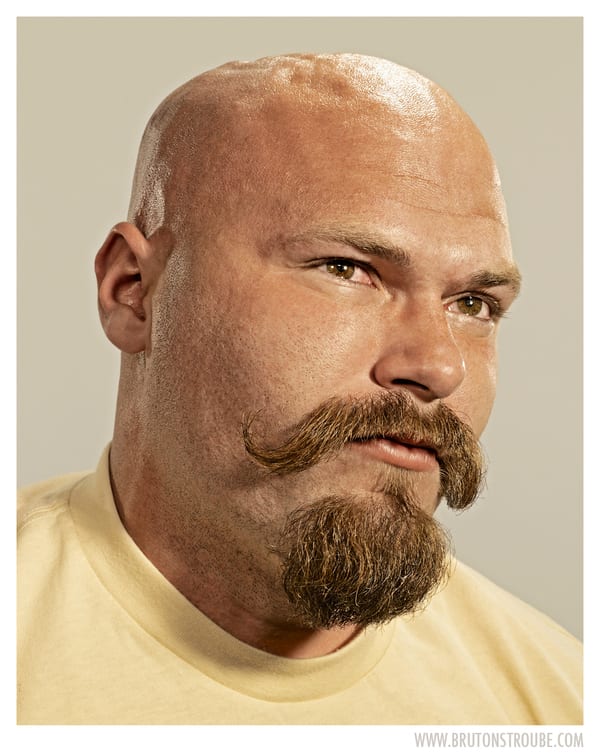
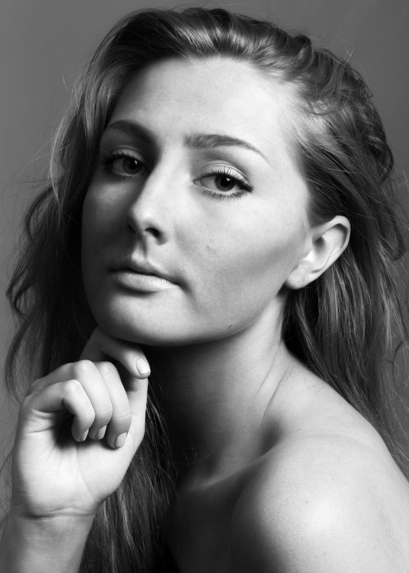
Originally, my thoughts were to produce three very similar studio portraits. However, after looking into the Taylor Wessing Photographic Portrait Prize (TWPPP) I noticed that a lot of the images are actually based either outdoors, or not within a studio set up. This really allowed me to think very differently about the whole concept of portraiture, and the fact that portraits are to capture image and identity. By taking a subject into a studio, you are depriving them of their personality with your artificial set up. If portraits are really about personality, then the notion of creating an artificial environment that the subject may have never set foot in before, completely contradicts the concept. Of course studio photography is very useful, not only for the tools available, but for commercial photographers, however I want to create portraits that reveal the subjects’ personality. I explored the website of Portrait Salon, and I found a lot of images that fitted my definition of a portrait. Some of my favourites I have provided below.
As you can tell in all the portraits above, every single image reveals either the subjects personality, interest, or both. I find these much more interesting than commercial portraits, just because there is so much more to look at within the photograph – not only does the subject tell a story, but the setting does as well. I will definitely incorporate this style of portraiture within one of my images, as I want to create a wide variation of portraits. As this image will be taken outdoors and not in an ideal environment, I will therefore have to use an external flash. I have never used one before so this will be a lot of fun to experiment with.
After looking through the rest of the website, I gathered a lot of ideas on how to create an unusual portrait. I wanted to incorporate an abstract styled photograph within my work, just because I want to create a contrast between my images. I was thinking what I could do whilst keeping my work fairly simple, and I came across a series of images by a photographer called Brandon Voges. The images essentially show people upside down, but with the image the regular way round. So the facial features of the subject and their hair alters due to their positioning, but the rest of their face appears fairly normal. It’s a very fun way of looking at portraits, as you start to think about the production of the images, and how the subjects would look if they weren’t upside down. Below I have collected a few of my favourites from the series.
I really love the bottom two images, simply because the subjects almost look completely normal. It is only when you understand that the subjects were upside down, that you are able to notice the changes within the subjects. I would really have been interested in some before/after images, just to emphasise the difference between the subject being upside down, but unfortunately these do not exist. I definitely want to try and create an image like this for my own project, and hopefully I will be able to pull it off successfully. I will be using the studio, simply because when I look at it, I get the idea that it is mocking studio portraiture: The perfect framing, great lighting and a backdrop, however the subject is the complete wrong way round – and I love that. I think it’s a very humorous view upon studio photography and I would like to recreate a similar feeling, but I do not think it would be possible if I were to take the photographs outside the studio.
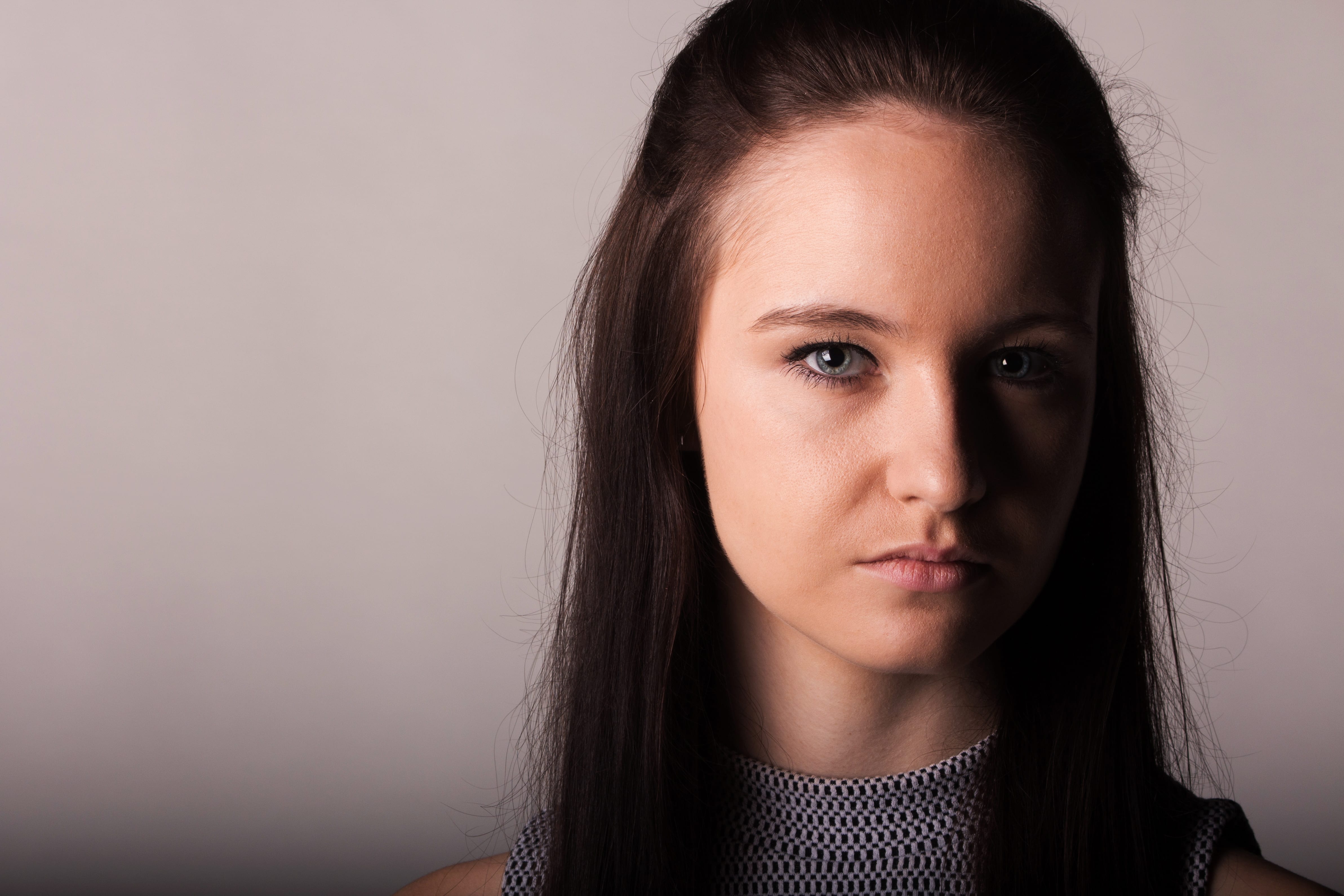
For my final image, despite insulting it earlier, I would like to try and produce some commercial portraits. Although I feel the other types of portrait express the subject in a better way, I am not of a high enough technical standard to never produce commercial images, so I would like to do so to develop my skills. I looked on the Shutter Hub website through a variety of portraits, and also at a few freelance portrait photographers to gather some inspiration, and these were the two images that caught my attention the most.
I really love the choice to make the images monochrome, as I feel it adds more class to the images. I specifically love the bottom image, I think the shadows being cast are beautiful and the idea to illuminate one side of the face and body just creates a mysterious edge to the image. I also love the subject’s poses within both images, they really fit in with the classiness, and they overall produce a solid photograph.
Within my portrait, I definitely want to incorporate a shadowed lighting set up, with one side of the face lit more than the other. I think this produces more of a mood, and is something that I will not be creating within my other images, so by doing so in this portrait, I will have a wide variety of images. I will shoot with monochrome bared in mind, however if the image looks better in colour, I will definitely keep it that way, I will just have to see how things go in the studio.
PREPARING FOR PRODUCTION
Within all my portraits, I will be focusing on the same subject to show different sides of their personality. If I wasn’t creating such a wide range of images, then I would definitely consider using different subjects to provide new aesthetics into the frame. However with all my different ideas, I think focusing on the same subject will allow them to be seen more as a set of images, rather than individual, and not only that – it will allow the audience a better insight into the subjects personality, which of course would not be possible if I were to use different subjects.
Below, as in the previous projects, I have listed a brief summary of what I intend to capture within each image.
IMAGE 1. Setting: Ext – alleyway/urban environment
Subject: Full body will be visible, subject will be looking at 90° angle in relativity to the camera
Framing: Either landscape of portrait depending on the potential setting and it’s detail – landscape is preferred – will give the subject space to look into and provide a more cinematic, urban photograph
Lighting: Either Metz flash or ring flash – open to experimentation
IMAGE 2. Setting: Studio with white backdrop
Subject: Upside down hanging from table/chair – looking into the camera
Framing: Portrait – chest upwards – allowing room above the head for hair
Lighting: Studio flashes, 2 softboxes and a backlight
IMAGE 3. Setting: Studio with grey backdrop
Subject: Stood up for better body posture – looking into the camera, wearing a white top to contrast with the background
Framing: Portrait – neck upwards, focusing on the eyes – close up of face
Lighting: Studio flashes, 1 softbox, backlight + light for the backdrop – lighting will cast harsh shadows on one side of the subject’s face.
FINAL IMAGES
Now unfortunately with this project I only had a limited amount of time to take these images, as I wanted to use my girlfriend for all of them. The outdoor wasn’t possible in this amount of time for two reasons; firstly it was raining really badly on the days I intended to shoot, and also I couldn’t light my subject correctly. I experimented with a few flashes, however they just didn’t look good enough. Also when in the studio, my upside down image proved to be too much hassle, and I gave up with the idea after a short while. Instead I have produced what I feel, are three very different images however all based in the studio. I experimented with lots of different lighting situations and backdrops and ended up with three images I am very happy with. I feel they are all technically worthy of submission to the TWPPP.
“Vitalism is a doctrine that describes living organisms as fundamentally different from non-living entities, because they are governed by different principles.”
I started to think about vitalism and what kind of principles are most commonly applied in peoples lives, which after a bit of thinking and exploring the web, lead me to social acceptance, a key area of study that fits in perfectly with the title of this project. I started to research a bit more into social acceptance within our lives, and why exactly people feel the need for it to exist.
Now, most people thrive social acceptance because they feel left out, or not ‘normal,’ which then can effect their confidence and personality. To become socially acceptable, they then adhere to specific styles of clothing, hair styles, brands and so on, which will then deem them more normal and acceptable in the eyes of the general population. I find this very fascinating and I must admit, it is not a concept that I myself can say I do not participate in. It’s an issue that affects the majority of our society today, and I think the fact that the worth of a human being measured via clothes, style and brand of possessions is ridiculous.
I think the biggest issue within our culture is the social hierarchy that has been established due to fashion and brands, and therefore the unacceptability of clothes, and people who wear said clothes, that do not possess a label or a significant brand. Of course fashion will never die down and people are allowed to have their own individual fashion tastes, however the victimisation of people not adhering to ‘popular’ conventions is unfair and outrageous.
Now after looking into social acceptance and branding I developed my thoughts to focus further on the unacceptability of unbranded items, and the prejudice of individuals based on their fashion style. People are no longer judged via their personality, they are judged based on their clothing choices, which I think is completely dehumanising. The value of a person is decided simply upon whether or not they wear branded items, and therefore I thought this would be a very interesting area to focus my practice in. It is also something that really irritates me, so I think I will enjoy expressing myself in the form of photography.
PREPARING FOR PRODUCTION
As this project doesn’t care about the identity of the subject, I will be using the same person to feature in all of my photographs, and he will be male as I feel that not only do more men wear (visibly) branded items, but due to me owning some of the clothes I would like to feature, it will be much more convenient. I intend to use a dull backdrop, either a grey or black, as I feel this suits the mood of the images – I think brighter colours would give off the wrong vibe. I will experiment in the studio, however as the images have to be in a triptych format, I would prefer if all the backgrounds were the same colour, or if only the middle image’s background was different to the two side images, that way it would be symmetrical and more aesthetic in my opinion.
After the previous project, I have had a much better experience with the lights, so I expect my photographs to be correctly and professionally lit. Below I have listed the images I intend to get, in order of left to right, to give a better picture of how I want my triptych to look. ALL images will start just above the waist to include maximum amount of the brand.
1. Adidas
Subject will be wearing white Adidas t-shirt
A printed Adidas logo will be stuck to the subject’s head, hiding their identity
Subject will wear Adidas boots on hands, for further branding
Backdrop will be black, allowing contrast
2. Fred Perry
Subject will be wearing black Fred Perry t-shirt
A printed Fred Perry logo will be stuck to the subject’s head
Backdrop will be grey, allowing the t-shirt to be visible
3. Apple Subject will be holding Apple MacBook and iPhone (Plus other accessories if possible (iPad, iPod))
Subject will be wearing a white t-shirt, with the Apple logo stuck onto it
A printed Apple logo will be stuck to the subject’s head
Backdrop will be black
FINAL IMAGES
I really enjoyed producing these images, I had a lot of fun with the flashes and lighting in the studio, and a lot more success than I have before. I can definitely feel an improvement in the quality of my images, and hopefully this is reflected within my grades. Below I have separated each individual image, followed by all three collated in a triptych.
For the first project I feel I may have over-thought the complexity of my idea and tried something slightly overambitious. For Creatures I want to do something much simpler, but hopefully equally effective.
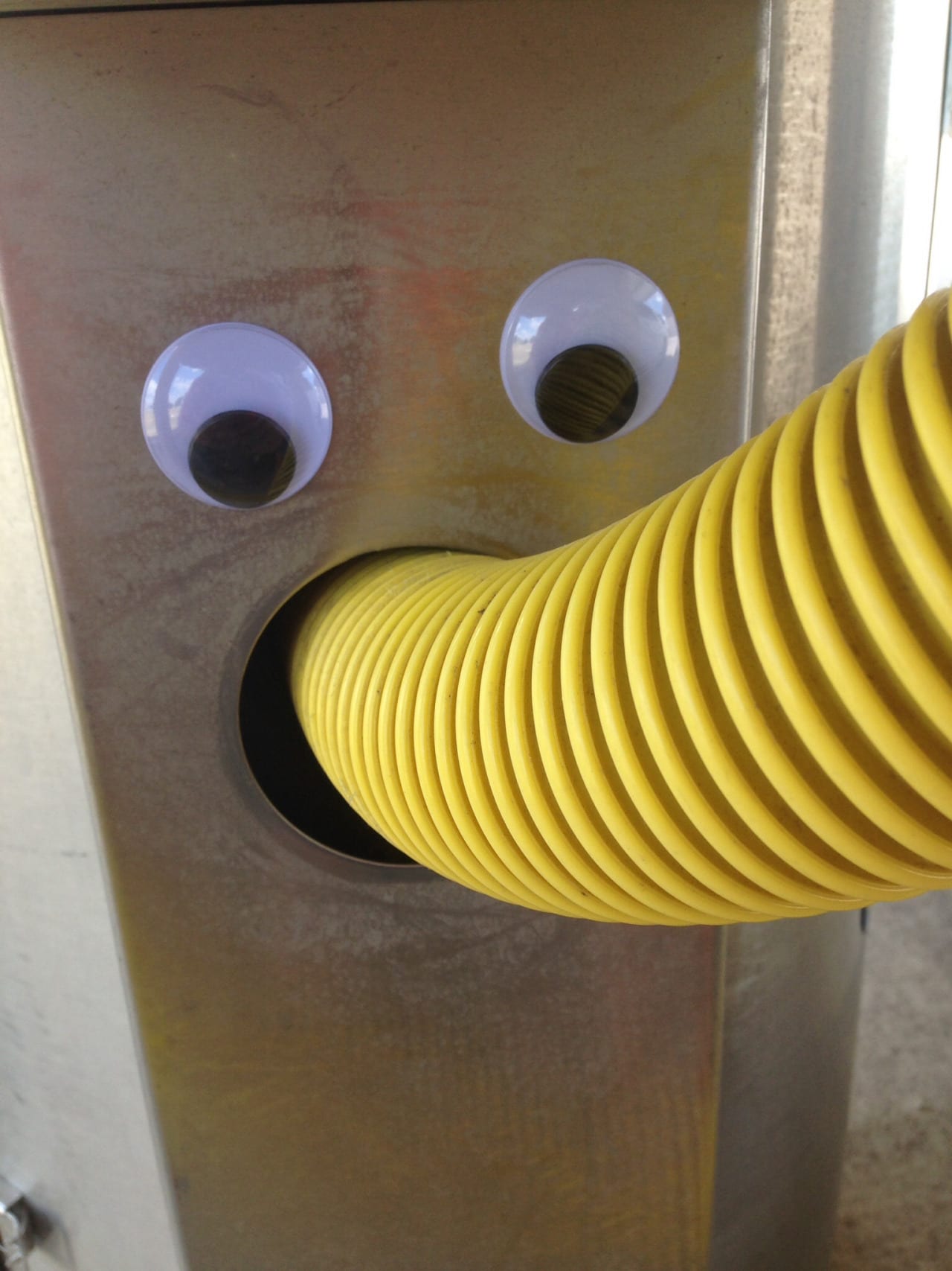
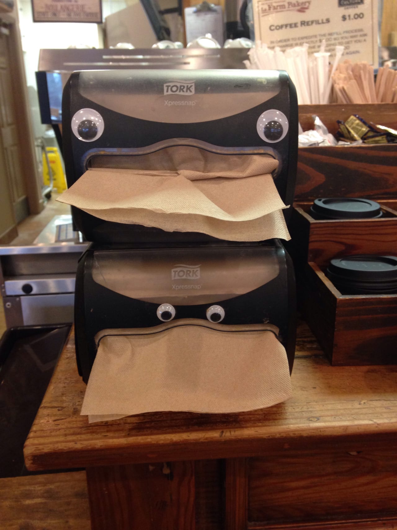
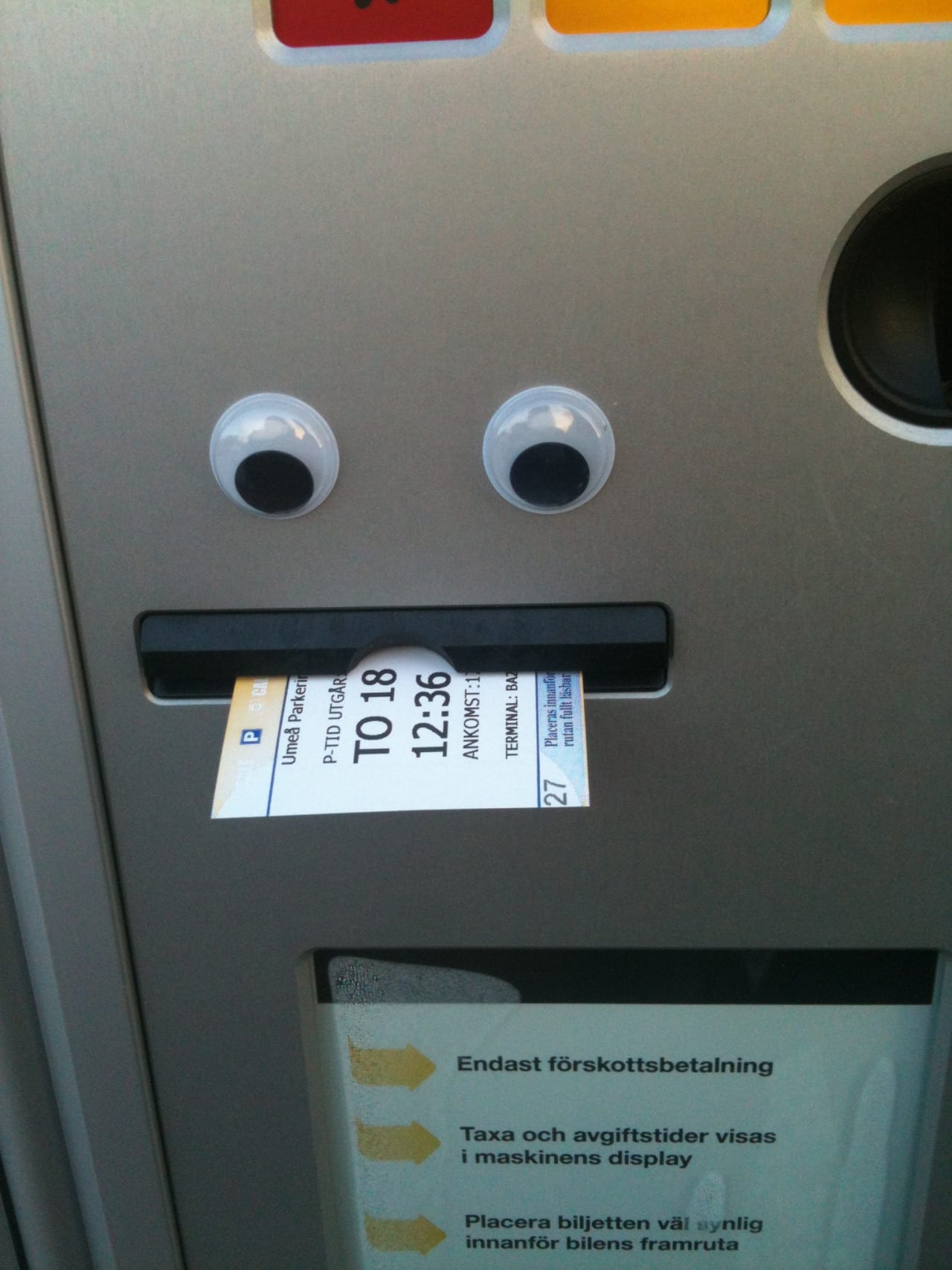
I started to think a lot about what exactly characterises something as a ‘creature,’ so what things make something look alive as opposed to an inanimate object, and the first thing that came to mind was the eyes. This gave me many ideas about what I could photograph, however my basic idea was to humanise everyday objects by giving them a set of eyes, so I started to look more into this type of humanisation within photography.
After looking around I first found a website called Eyebombing. As explained within the websites ‘about’ section, Eyebombing is the art of sticking “googly eyes” onto an inanimate object in the public sphere, in a way that cleverly lends the object the appearance of a living creature. The purpose of doing such is to bring joy and happiness to people passing in the street, and to make them smile. It is not at all for the artist to gain recognition, it is for the benefit of the public, which I find very interesting. I see it as more of a movement searching for the involvement of other individuals and aiming to please the community as opposed to one or two artist’s trying to become popular and gain money. BBC News covered a story on Eyebombing, which explains the process in more detail, and includes some public responses to the act:
Not only do I find this practice intriguing, but the concepts and reasoning behind it really appeal to me. I like to spread happiness and joy so this work really connects with me.
The only difference between what I hope to do, and the act of Eyebombing, is that my work will be studio based, however I think this allows for more creativity and various technical choices to be made instead. This also means that I can not approach everyday items in public, I will have to acquire my own objects to take into the studio which led me to develop a few ideas.
I feel that fortunate people have household objects that they take for granted, primarily electronics: phones, phone chargers, laptops/computers and the internet (represented by a router), but also everyday items that we actually need, such as water, clothes and even plants and trees. I will need to select items specifically, however applying googly eyes to items like these, which are rarely appreciated unless broken or lost, will personify them, giving them an identity. I think this is important as all creatures, both animals and humans are appreciated much more because of their personalities and sense of life, so hopefully humanising these everyday objects will make people who view my images appreciate their personal good fortune and luck, and consider treating their belongings with more respect and care.
PREPARING FOR PRODUCTION
Unlike the previous project, I have (thankfully) planned to only spend 1 or 2 pounds, and this will be on the googly eyes alone, as all of the objects I will be photographing will be my own personal belongings. The objects I will be photographing in the studio I have listed below, in a similar fashion to my preparation for the first project:
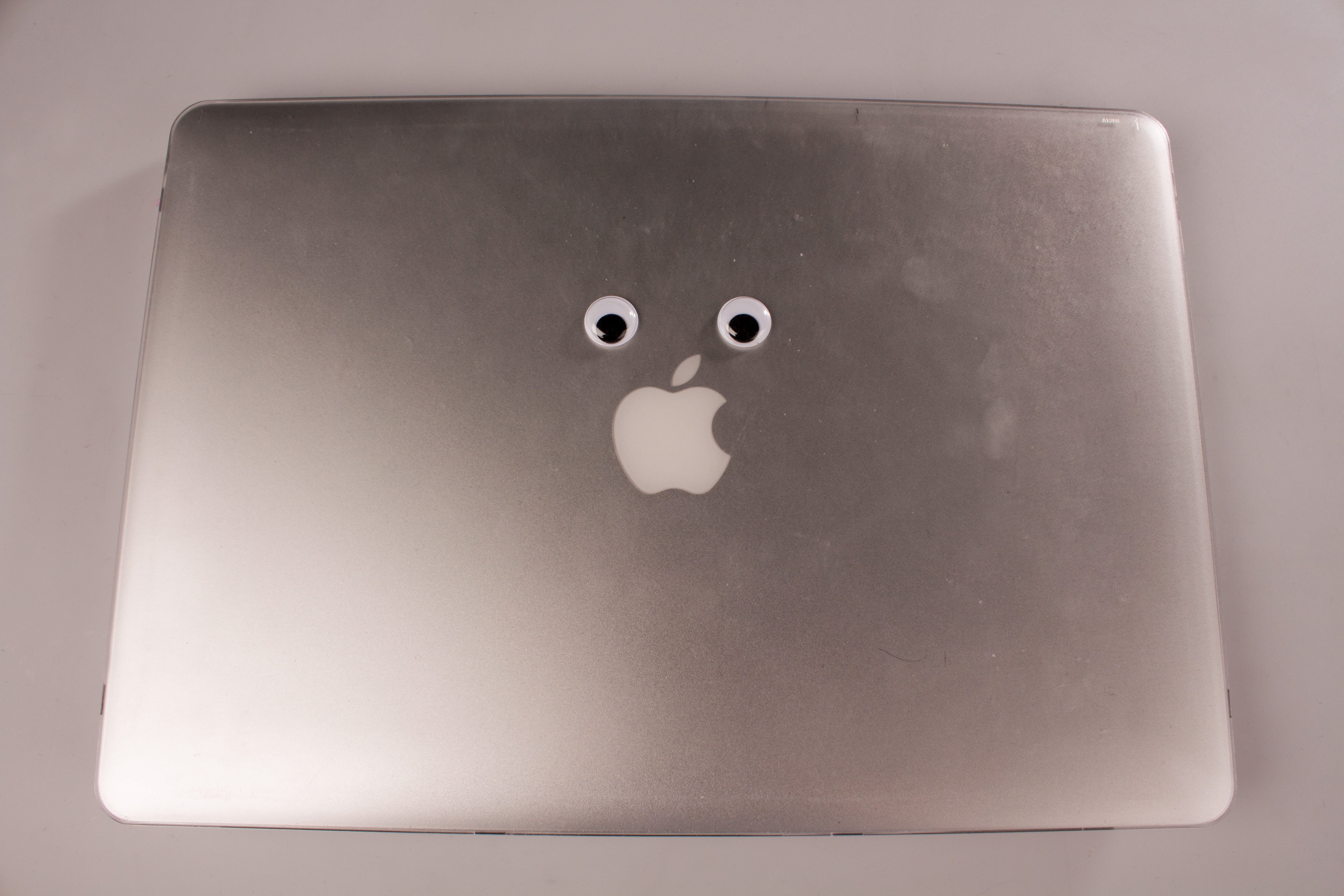
1. Apple MacBook Googly eyes will be located above the Apple logo, implying it is the mouth
The case on my laptop is a bit dirty, so this will show misuse/lack of care
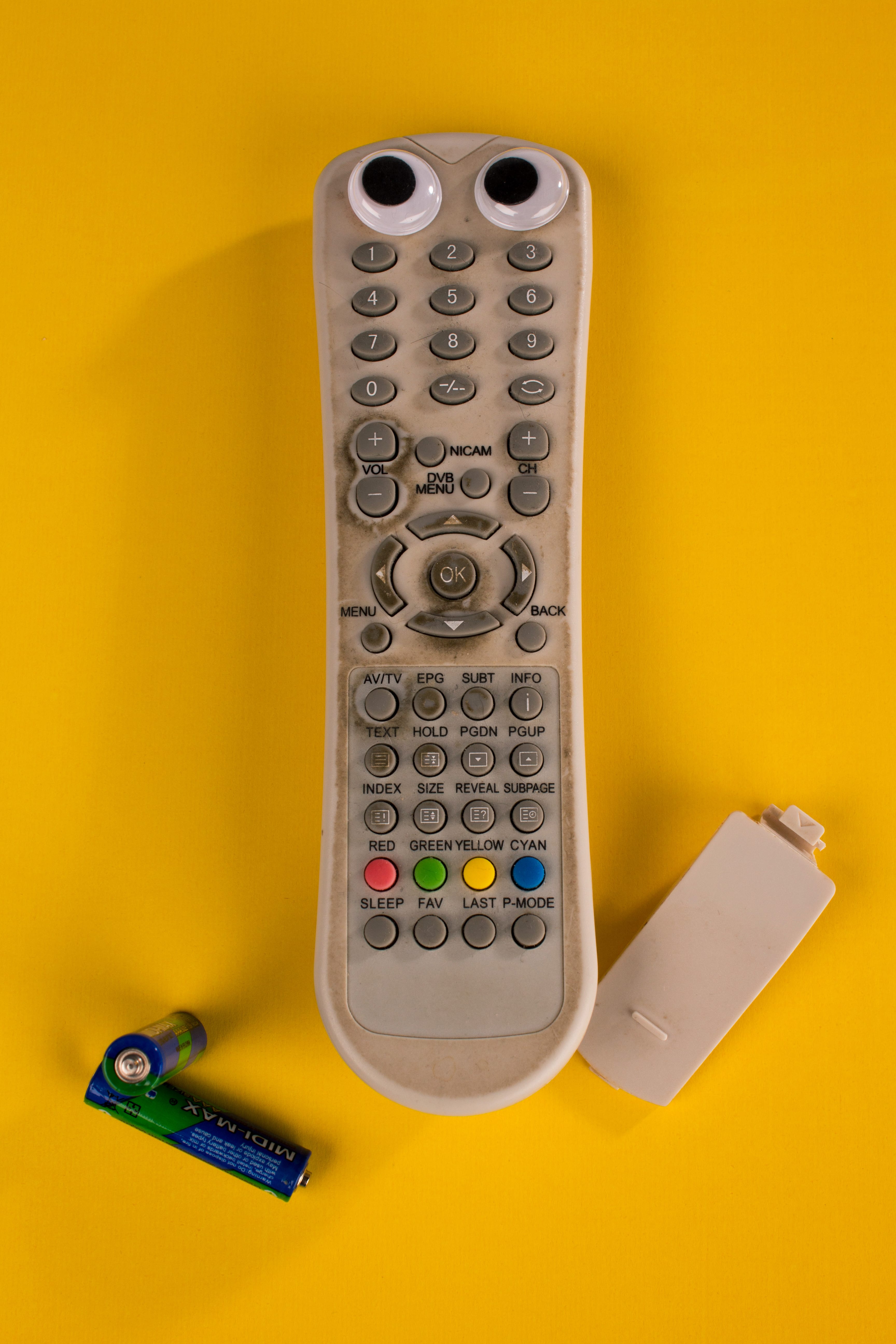
2. Television remote I have a really grimy remote that I have had for years, that will be perfect to represent a lack of care
Googly eyes will be positioned on either the top or bottom (if upside down) of the remote
Batteries and back piece will be used as either arms or legs
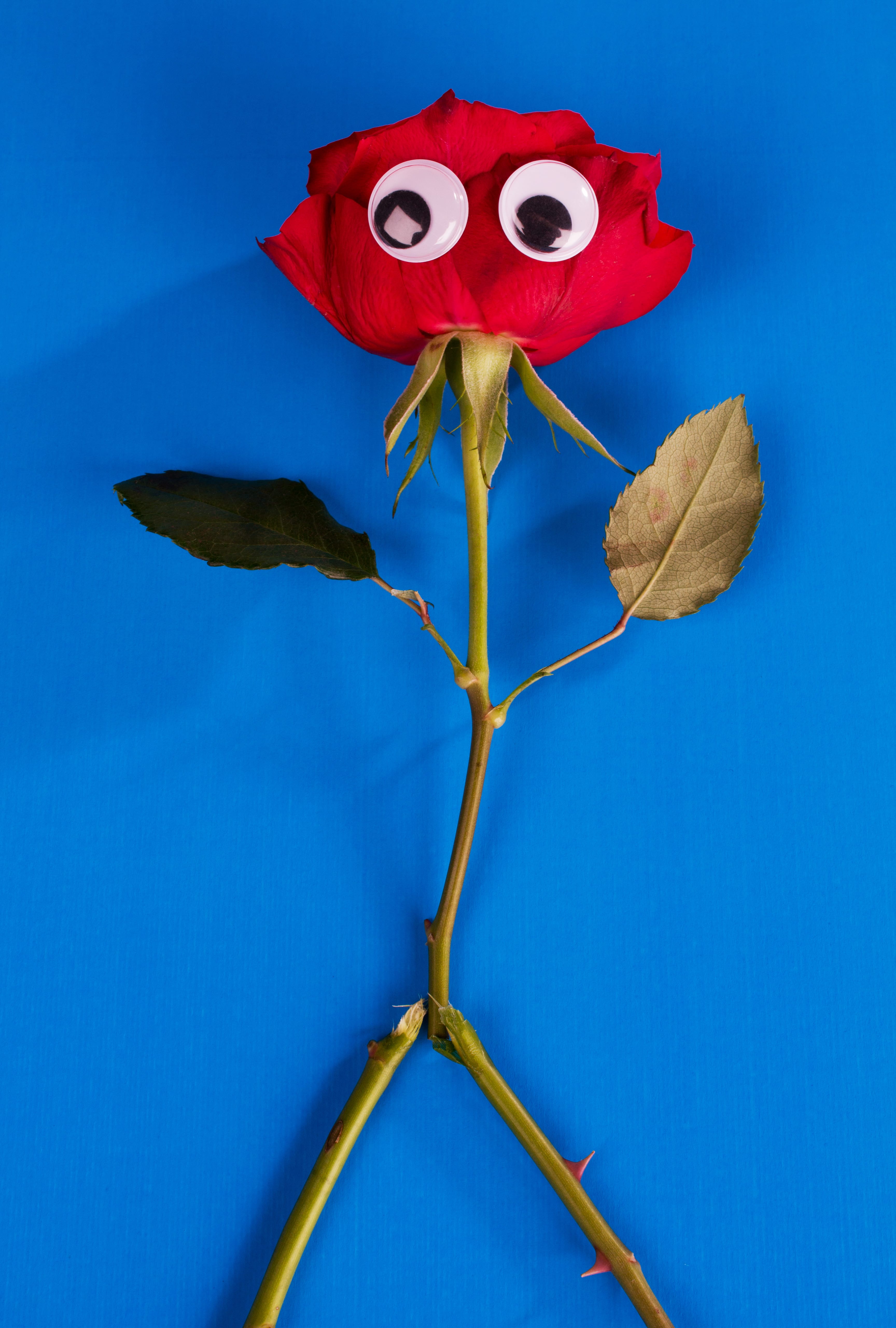
3. Flower
Either a flower from a supermarket or from my back garden
Soil and dirt over the flower
Wilting due to lack of water
Stem will be cut and used as arms and legs
ALL googly eyes will be positioned in a way to make the objects look sad/concerned.
For this project I want to focus so much more on my lighting, as it was terrible in the previous project. I have made sure I have booked the appropriate equipment, and also as this project doesn’t require as much preparation, I will have so much more time to experiment and play around with the lights, which will allow me to create the correct mood with my images. I want to use the flashes, and understand them a bit more, as it will benefit my future projects if I can comprehend how the lighting is used to set a certain mood.
With Project 1 following the philosophy of new formalism photography, I decided to try and expand upon these ideas and include them within my own practice. By doing this, I first needed to better my understanding of what exactly new formalism is. I delved into the magazines Toilet Paper, and Conscientious, both of which I was introduced to briefly within lectures/workshops. I also looked into a few other websites and photography projects too, to examine the images and see what exactly is classified as ‘new formalism’.
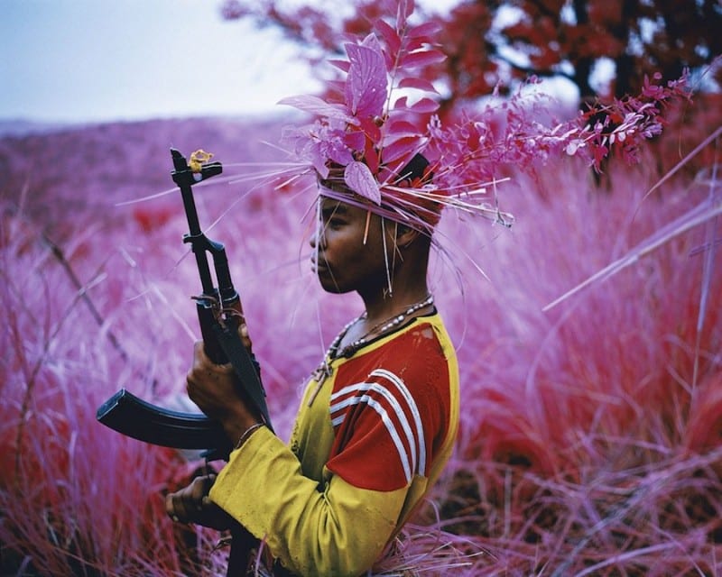
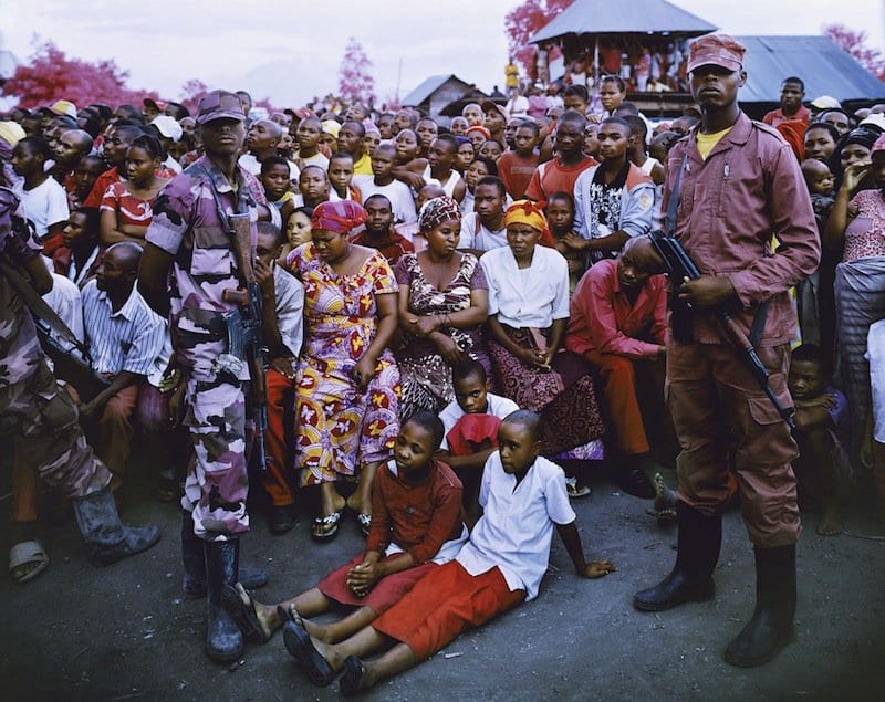
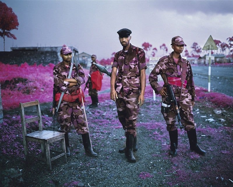
One very interesting project that I found is Richard Mosse‘s The Enclave. Using Kodak Aerochrome film developed for the military in the 1940s, Mosse travelled to Congo to photograph the landscapes and the local people. The benefit of using this film type is that greens are transformed into shades of pink and red, making the images look much less serious and in this case, more comical. The trees and grass are a beautiful shade of red and the soldiers wearing their army uniforms have a pink camouflage design. What I love about these images is the complete juxtaposition of the use of pink, a colour often connoted with femininity, which completely destroys any intimidating value that originally existed. The pink entirely redesigns the image and the soldiers immediately appear to be more ‘camp’, an outlook that would never have been visible without the use of this film type.
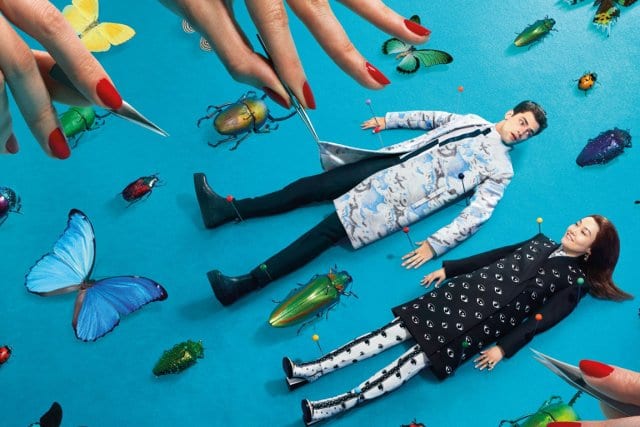
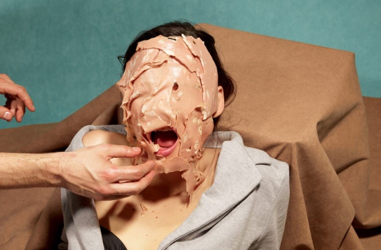
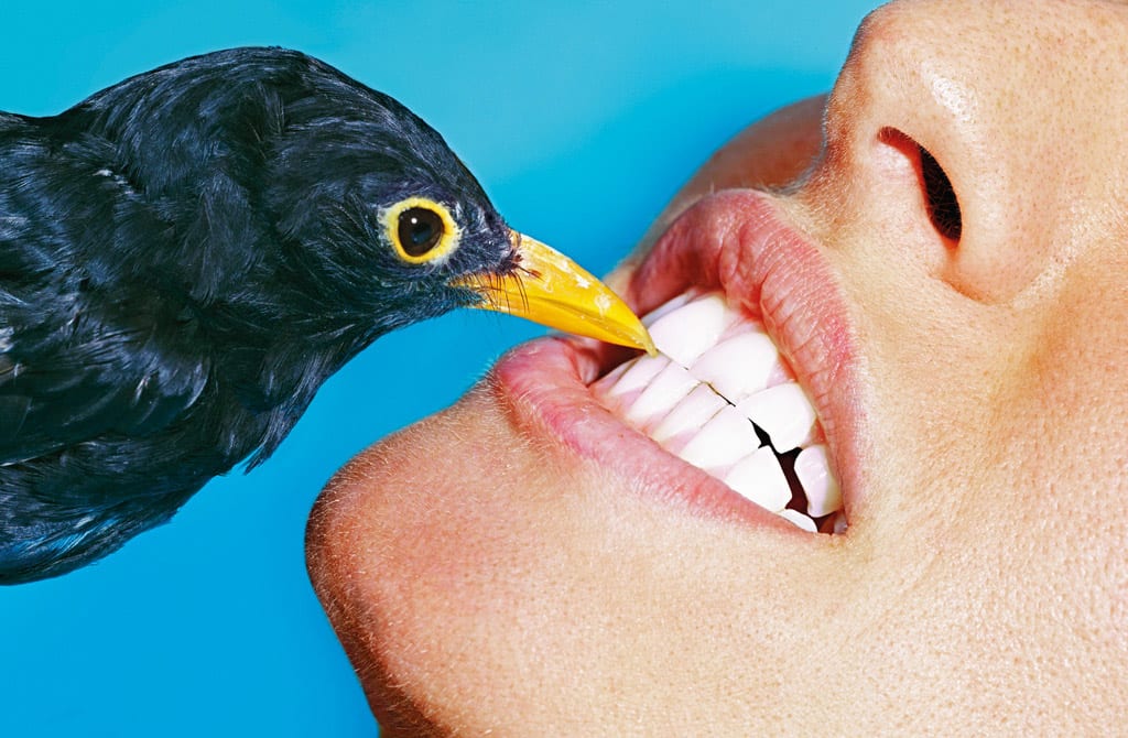
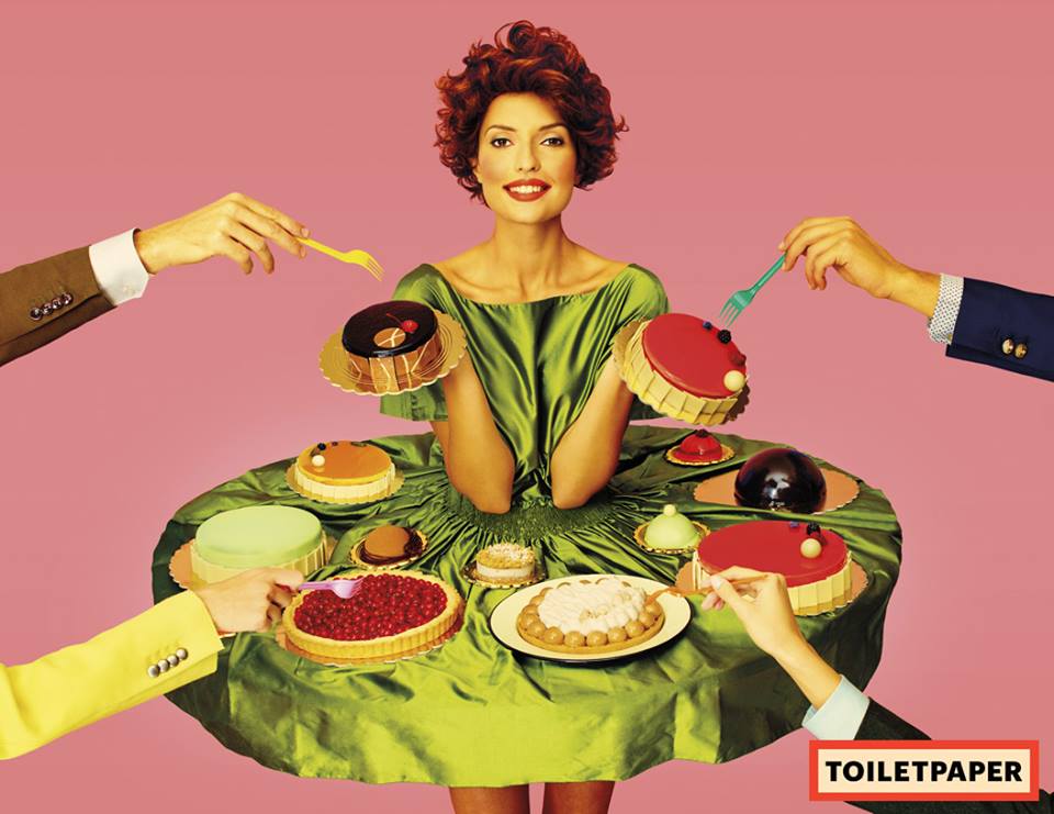
The definition of Formalism within art history is the study of art by analysing and comparing form and style – the ways that different objects are made and their pure visual aspects. Formalism emphasises compositional and perceptual elements as opposed to iconography or historical/social context. It is very clear that New Formalism photography follows these guidelines, which is exemplified in the images above. Within the magazine Toilet Paper the photographs are a lot less comical, however much more surreal and any person within the images is drastically dehumanised, and presented merely as an object. I really admire this approach to subject photography, as it toys with commercial photography and discards the idea of the subject being central and crucial to the image’s success.
Within the first image, the subjects (although clearly showing some humanity) are compared to dead bugs, as if they were part of the collection. Whereas in the other two images the subjects have been completely dehumanised and are completely useful only as objects. I really love this style of photography, and it’s surreal elements really commence an initial reaction of “that’s weird”, however, I don’t just want the audience of my images to have that single reaction, I want to trigger more of a response. So bearing this style in mind, I looked further into Toilet Paper, and focused more on images of food, as my ideas were starting to develop more specifically.
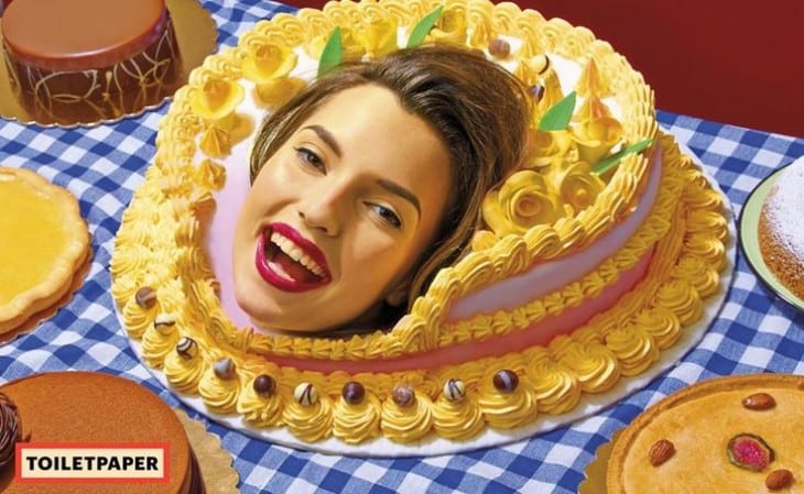
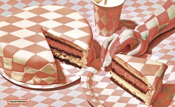
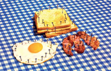
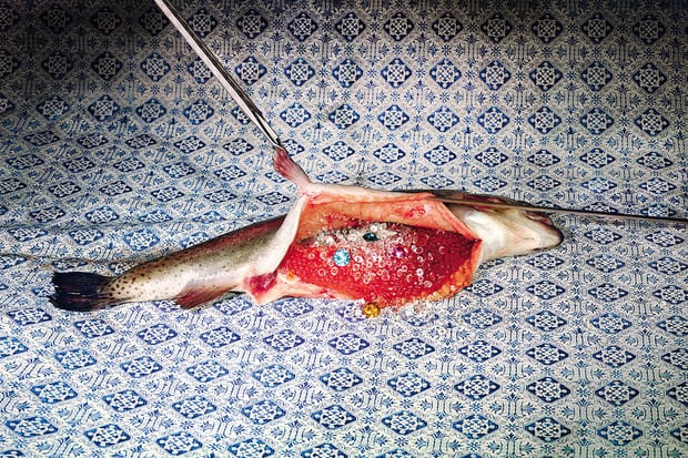
These photographs take on a very 1960s esc style; not only through the subjects’ outfits, but through the colours and general tone of the image too – they really display old fashioned characteristics. What I love most about these photographs is the juxtaposition between modernity and classicism. For example, in the first image displayed you see a beautiful cake, decorated in a very smart, delicate, yet classic manner placed on a typical checkered table cloth. Both the content and technical production of this image would lead you to believe that is from the previous century, however with the addition of a subject in such a way as shown, it portrays a very modern, abstract style. I truly admire the disruption of the perfect presentation of the food, as shown in images 1, 3 and 4. The two major opposites of beauty and destruction clash impeccably in my opinion, which lead me to further research and inspiration. I decided to focus more on the destruction of beautifully crafted food, however instead of it being damaged by subjects; by objects instead.
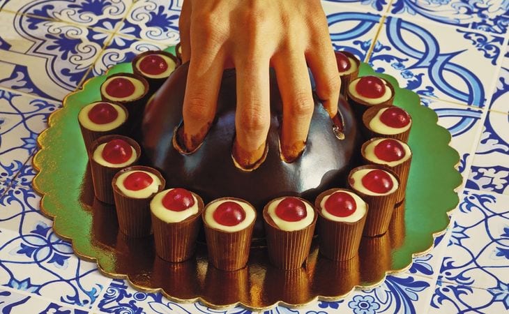
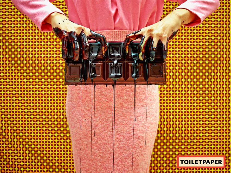
These were unfortunately the only two images that I could find, as I couldn’t get my hand on a physical copy of Toilet Paper, and due to this there is also a lack of images on the web. However these images have still given me great ideas to what I hope to achieve. Going back to the previous paragraph about the destruction of food, I really admire how inedible objects are ruining otherwise edible food (despite the uncooked fish). This got me thinking a lot about commercial food photography and the disappointment when actually ordering food and thinking “that’s not what it looked like on the picture”, a common issue that I am sure that I am not exclusive to noticing. This also related back to the images of beautifully presented food being ruined and looking completely unappealing. I therefore decided to set my sights on a final idea, and that is to create mock images of commercial food photography. What I will be attempting to do is to recreate commercial food adverts however either with the addition of inedible objects or aesthetically unappealing variants of the authentic ingredients. I want to add a comical edge to my images whilst also incorporating the colourful, attractive style of new formalism photography, which will work in beautiful contrast with the un-aesthetic meals.
I decided to research into commercial food photography to develop a better insight for the stylistic approaches used. I want to recreate the images by copying the colour schemes and psychological effects that make the audience more attracted to the food, and then juxtapose this with my own, unappealing presentation of the food itself. To do this I first had to look into colour meaning and the subliminal messages that certain colours send to our brain. Now whilst subliminal advertising works primarily in video form, the messages that fonts, colours and the composition of a photograph send to our brain are essential in commercial food adverts, as we need to feel an urge for hunger that makes us buy that particular product.
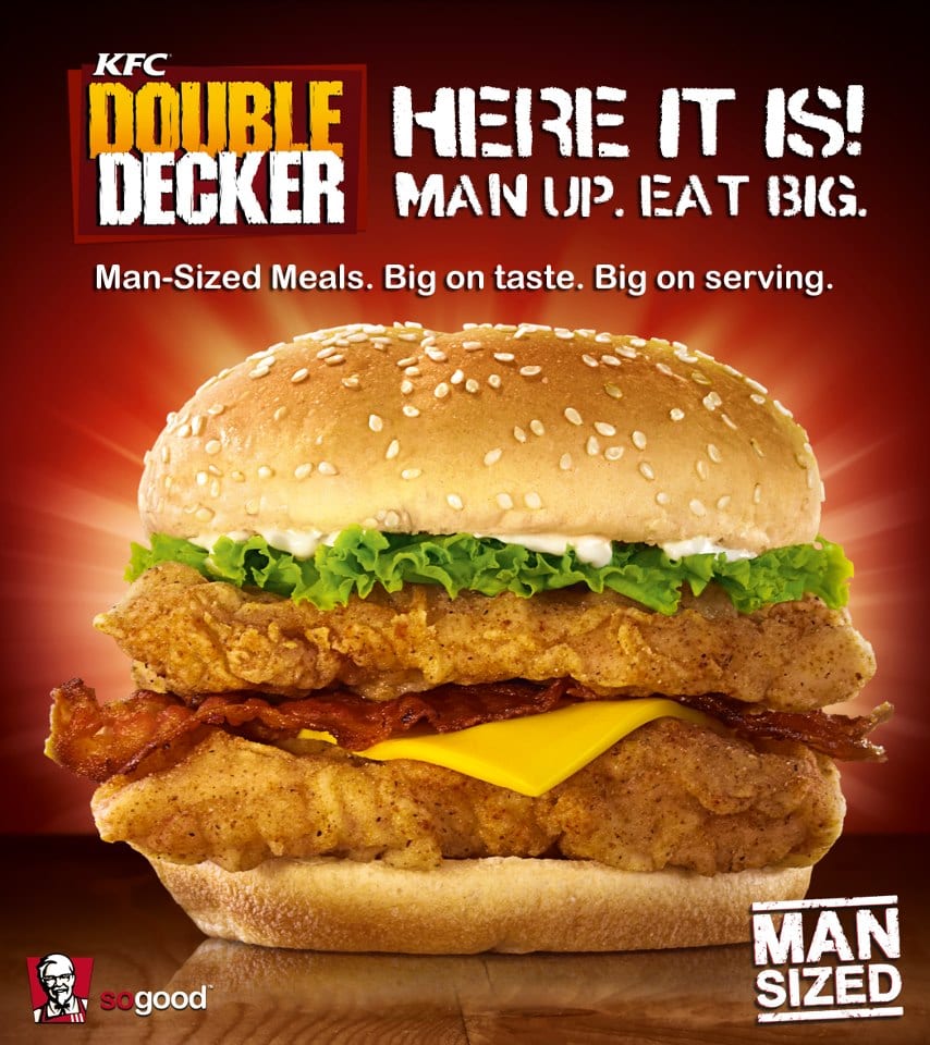
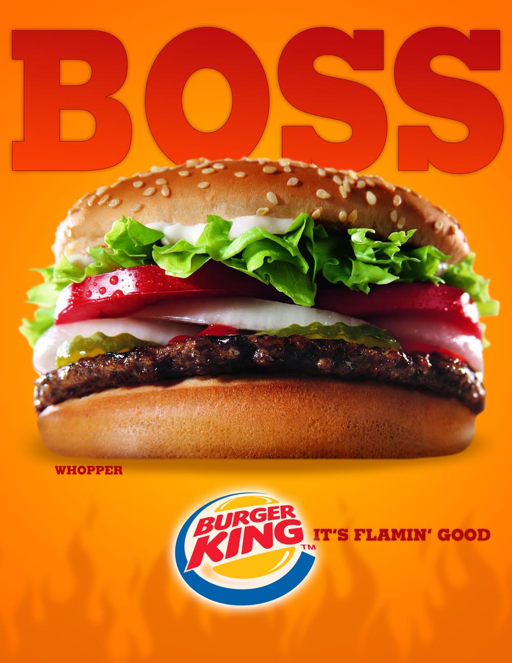
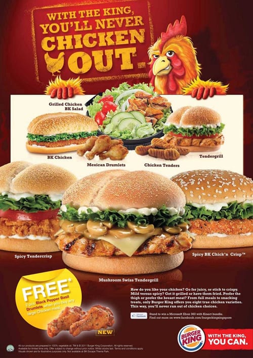
Looking at the food posters above, the predominant colour in the posters is either red or orange. Red is associated with warmth and energy, something which all of these foods provide. It is also associated with excitement, masculinity and physicality. Results from a questionnaire showed that a significantly higher 84% of men ate at a fast food restaurant at least once per week, compared to only 58% of women, so the use of the colour red is to appeal more to the restaurants’ primary demographic. Orange, like red, also connotes a feeling of warmth, however more importantly it provides physical comfort. I think this is a really important element as many people who are sad will comfort eat, and orange is furthermore inviting them to do so. I feel that from these posters, warmth is the most important feeling presented by colour, as warmth is associated with love, laughter and even physical warmth in the form of holidays, all of which provide happiness. By connoting happiness through such specific colours the adverts manipulate your mindset and convince you that eating this food will make you happy.
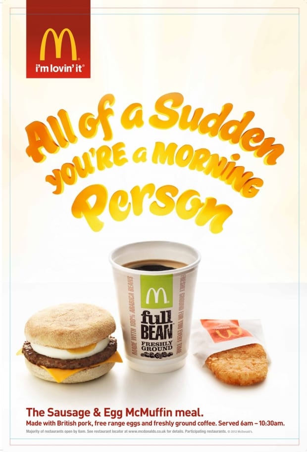
In the final poster, white is the dominant colour as opposed to red or orange. I personally think this is a very clever poster, as not only does it differentiate from the others in forms of aesthetics, it makes you feel a different way too. Now the colour white is associated with sophistication, efficiency and purity, all of which provide a very different feel compared to red or orange. This is because the poster is advertising breakfast, and is therefore appealing to a different audience. (Typically speaking) Lazy people sleep in and miss breakfast, whereas sophisticated and efficient people are always awake early and therefore possess the need for food in the morning. The poster targets these individuals by it’s use of white, as opposed to red or orange.
After studying colour within adverts I feel it is important to also take note of the presentation of food, despite the fact that I will be mocking it. Looking at the images above, each item of food is precisely placed in the right location, and perfect samples of each item are sourced – meaning the best burgers, lettuces and tomatoes are chosen in order to increase the aesthetic value of each item of food. I will mock this ‘idealised’ placement of food by not representing the caution that is otherwise shown. I looked into a behind the scenes McDonald’s photo shoot to get a better insight to how exactly the professionals do it. The results were very interesting, as the amount of care and detail shown in both production and post production is exceptional.
PREPARING FOR PRODUCTION
For my final photographs I will be creating three separate images, so I will not be compiling more than one item of food into each photo, I want to focus on one at a time. I have decided to focus on burgers, simply as they are one of the primary images identified with fast food, and also because they will be easy to manipulate. The style that I have decided to stick with is using both inedible and incompatible yet edible items, and using these as toppings for the burger. Below is a list of some of the items I am planning on involving within each burger.
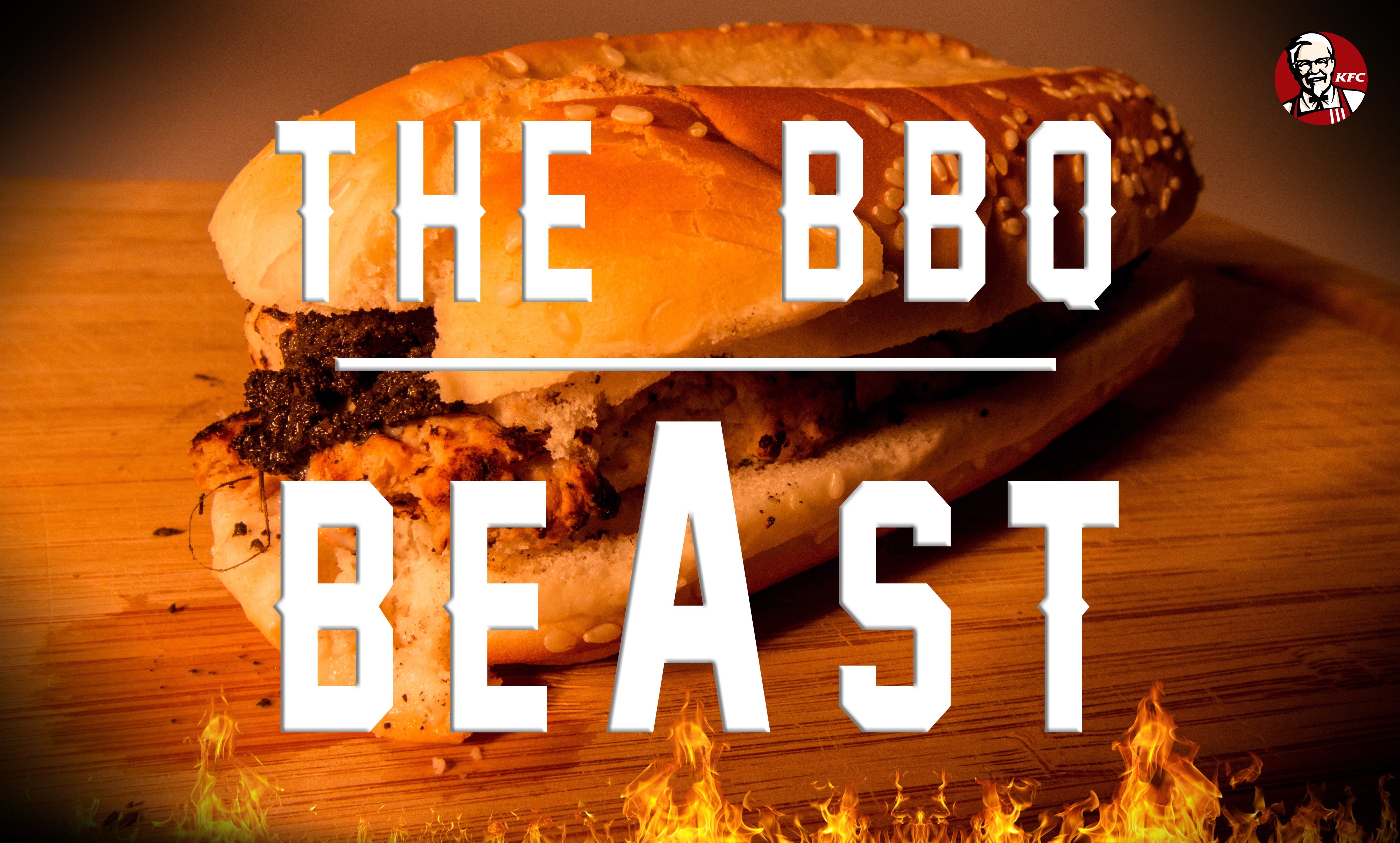
Burger 1. Beef burger – regular burger with indentations to look less appealable
Slice of cheese – dirty baby wipe
Sauce – chocolate milkshake to replicate the bbq sauce.
Bread – sesame seed with indentations
Background – chopping board
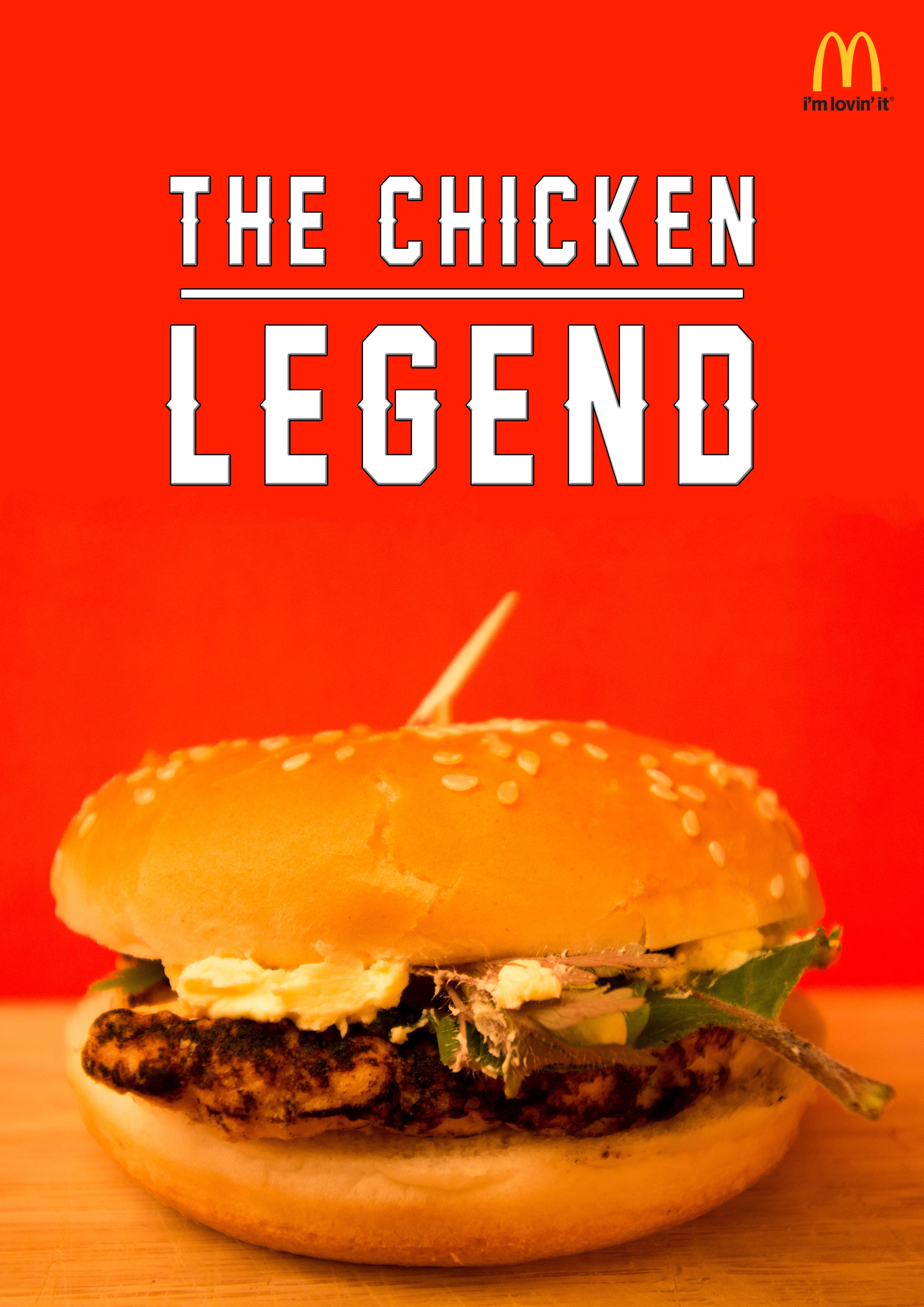
Burger 2. Chicken burger – regular piece of chicken with indentations
Salad – grass and leaves
Traditional stick going through the burger – broken, used toothpick
Sauce – margarine
Bread – regular with indentation
Background – red card
As I am fairly new to lighting, I will be experimenting in the studio, and I don’t have an exact idea of what I hope to achieve. I will be using either one or two flashes, or the LEDs, however like I said, it will all be an experiment.
Lens wise, I am not sure what to use. A wide angle lens will give the impression that the burger is larger, however it will include more of the background, and I am focusing on either using A4 card or the backdrop, so this will not help. Whereas, a macros lens will allow the detail of the food to blossom, also improving it’s appealability. I will take both types of lenses into the studio with me to allow for experimentation – I have a whole two hours and I intend to make the most of this time.
PRODUCTION ISSUES AND THE NEXT STEPS
As I previously explained, I wanted to experiment with lighting in the studio, however I didn’t know that my camera required a shoe cord. So, once in the studio with limited time and everything set up, I had to use the modelling lights and LEDs for my lighting source which effected my work dramatically. I still feel that I have photographed the burgers with the correct proportions to make them look bigger, and I also think I have positioned all the topping onto the food correctly, so that they are visible to the audience.
My main problem like I said is the lighting, but other than that there were no other main issues. All I need to do now is add some text on Photoshop, and change the images into a poster. Using the plans that I laid out previously I want to make the food look as appealable and as similar to real food adverts as possible, and if I can do that, then I will be very happy with the quality of my work.