Project 6: Interference

For this project I wanted to create something with a less serious tone to some of my other pieces of work. As I simultaneously study Film Production, I understand how to light a subject for film as opposed to for a photograph, so really I should have the upper hand over some of my classmates. I feel that this project is a lot more open to interpretation than some of the other projects, so I have used this to my advantage when considering what type of styles I should be adhering to.

During the lecture we spoke about the uncomfortable nature of the video portrait, and how as people, we tend to dislike eye contact. My first impressions from viewing some video portraits were as I just said, uncomfortable. For my project I wanted to do something that wasn’t as uncomfortable, despite the eye contact.

I therefore decided to research into a few other video portraits to gather some inspiration and ideas. I looked at the work of Robert Wilson, who has taken many video portraits of both celebrities and animals, which I thought were two very contrasting ideas. His work of celebrities is very serious and has a very sinister tone to them. For example Wilson created a video portrait of Brad Pitt, where he is simply staring down the camera in a dominant stance as rain begins to pour down on him. Wilson also created several, less serious video portraits of animals. I personally preferred this section of work, as they added a much more comedic tone, something I was hoping to achieve with my own project.

After looking at this I came up with two, quite different ideas.


Idea 1.
3 different subjects will be exposed to three very different genres of music and left alone in the rooms. They will be filmed for around 10 minutes each, and the camera will observe their natural actions with the songs playing. This is purely to observe the differences that certain favourite genres of music have on us, and how we behave without actually noticing.

Idea 2.
3 different subjects will each be given a gulp of water to hold in their mouth, and they are not allowed to swallow it. I will be playing funny videos to the subjects and telling them to try not to laugh. Based on conventions of culture and previous experiences of seeing people in similar situations to themselves, the subjects will try to hold the water in their mouth for as long as possible. It is essentially a test, and it will be interesting to see how specific individuals deal with the pressure. Not only will spitting out the water expose the subjects to failure, but it also shows their personality traits, and how susceptible to laughter they are. DON’T WORRY – There will be a bowl on the floor to catch the water, it will not go on the studio floor/equipment.


FURTHER IDEA DEVELOPMENT

After creating two very different ideas, I decided to decide on Idea 2. to by my final project. I chose this simply because I think it will differ from a lot of the uncomfortable, sinister video portraits that I have seen, and will provide a more funny, enjoyable video. Not only this but I think this idea will be much more fun to make, and it will be very interesting to see how my subjects react within these situations.


PREPARING FOR PRODUCTION

After crafting the foundations of my idea, there wasn’t really too much development that I had to indulge myself in. As I said earlier, I will be taking a bowl into the studio so that I do not spill water, as obviously I don’t want to damage/ruin anything.

For framing, I was thinking of placing my subjects in the center, as placing them on one of the thirds just wouldn’t look right for this kind of project. Plus, I want them to look directly into the camera, not past it, so being central will look best for this. For lighting, I want to use a three point lighting set up, typical to film manner. After undertaking all my preparation, I decided that I was ready to go and shoot.


FINAL VIDEO

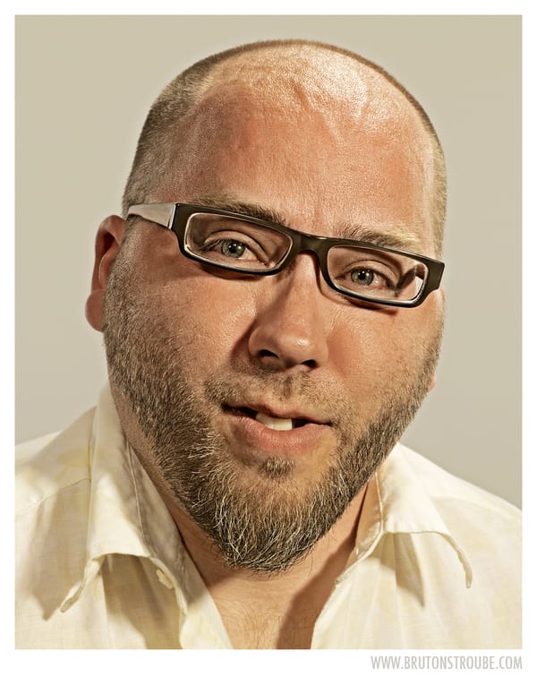
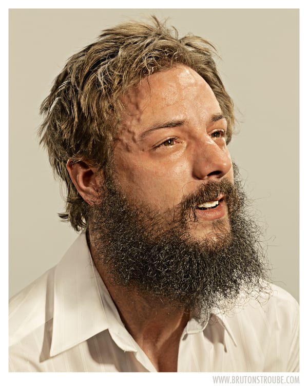
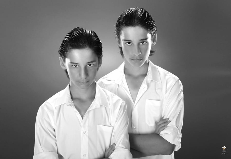
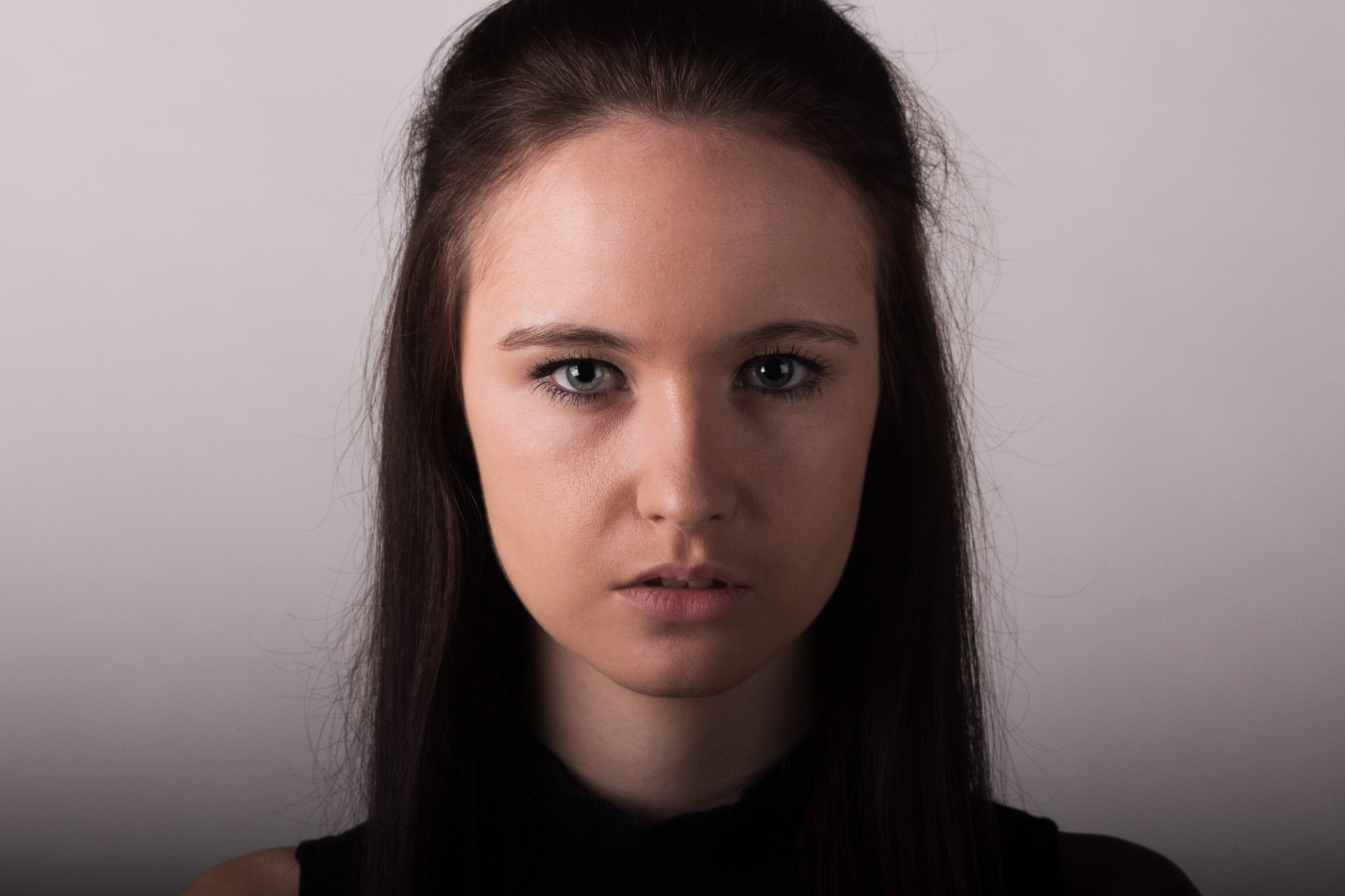
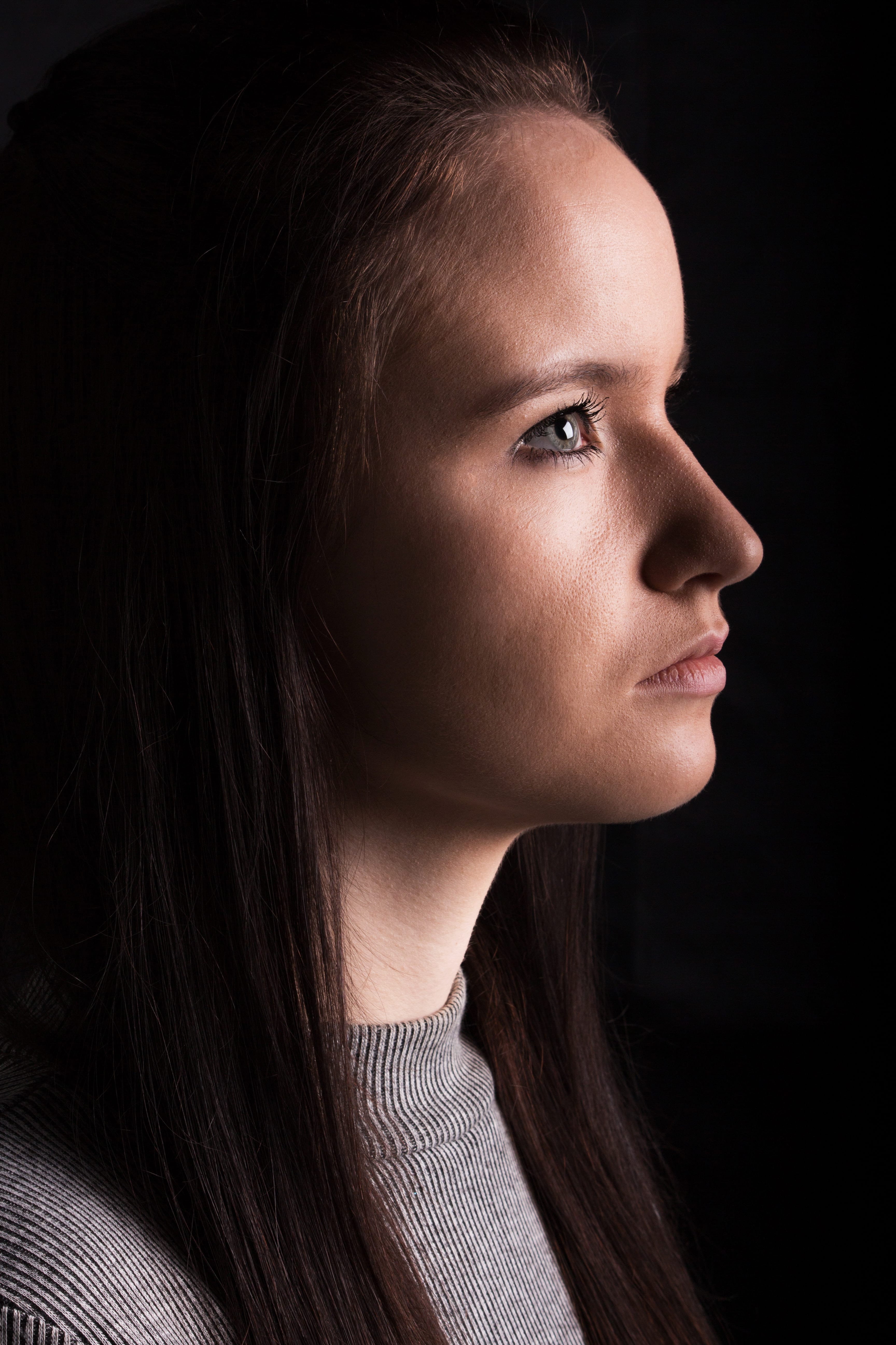
When in the studio, I actually had some issues with lighting. Wherever I placed my three lights, there was a shadow on both sides of the nose that I just couldn’t get rid of. After around half an hour of experimenting, I decided to scrap this lighting idea, and instead I use one fill light and then two back lights, casting a shadow on one side of my subjects face. However, I feel that this worked really well, the lighting actually reminded me of spotlight lighting used in comedy stand up events, which really matched the style of my video. So despite the lighting not going as planned, I still think it worked really well.

The only other issue I faced during the production is that one of my subjects backed out. I was going to have three subjects, however I feel it actually works better just with two. I have one boy and one girl and the even split of screen time between them works better than I imagined, I feel if I used three subjects it just wouldn’t have worked as well. The video also climaxes well, with both subjects sort of competing with each other in a one versus one fashion, again something I don’t think would have worked with three subjects. So all in all, I am very happy with this video portrait.

Project 5: Typology of a City

After undertaking some reading and looking at some examples of photographic typology, I have reached the understanding that it is essentially photographs that are the same, but different. By this I mean the subjects/objects being portrayed are very similar, but there is always a slight difference between them all – this could be composition, the object being photographed, the surrounding area and so on. Before I start to develop some ideas, I want to take a look at other typology photography, to gather a few ideas and to also discover what makes the series of images so interesting.

310311_louisepreedy_typ 2300519878_8f573d8a59tumblr_lm3078P0JR1qb0p52o1_500berndbecher3-1

As you can see from the images above, there is always certain similarities/something that is the same, within each photograph, but there are slight changes making them work together superbly. I really love the picture of the TV aerials, as the primary thing that changes within each image is the composition. I think this really makes each image stand out from one another, whereas in the other photos, each individual image looks too similar for my liking. I definitely want to adopt this method within my own set of images, as I just feel it looks the most interesting.

To gather some more information, I looked on photographer Steve Tyler‘s website. He puts a lot of focus into typology, and some of his concepts are really interesting. The following pieces of work emphasise how much waste humans in more economically developed countries actually produce. He includes items that we deem as insignificant, yet we don’t appreciate the value and importance of how fortunate we are to be able to use said items. This concept fits in with my second project, and is something I feel very strongly about.

Cap Final Copy Final Small Edit Copy Final Tiny

Now as interesting as I find this work, I really don’t want to incorporate the same ideas within two different projects, I would like to experiment in different ways. However, looking at Tyler’s images has diverted my thoughts from the identity of individuals, to the identity of a city. I began thinking to myself about the differences and similarities between Lincoln and other cities, and the first thing that popped to mind is  the Victorian style that the majority of the city adheres to. Now my first idea was to photograph the cobbled pavements and create a huge grid with all of these images in, however I feel that this portrays Lincoln as old-fashioned and not modern, which is not a style that I particularly deem as a positive. Instead I wanted something that portrays both Lincoln’s old styles with it’s new, in a converging manner.

prt_220x222_1353863944

I found this image, and despite it’s lack of detail, it gave me the inspiration to photograph lamps/lampposts within Lincoln. Up towards the top of the cathedral there are lots of old fashioned lamps and obviously towards the bottom of the city, it becomes more modern with typical lampposts. I think it would be really cool to portray the difference between technology and contrast how Lincoln essentially has the best of both worlds. Not only this, I feel it is very important to emphasise Lincoln’s cultural background, as both of these contrasting styles interest different audiences.


PREPARING FOR PRODUCTION

As for this project I have to produce a series of images, opposed to a minimum of three, I intend to (obviously) shoot all of my photographs outdoors. However, I don’t just want to photograph these lights during the day. I think it would be really cool to photograph the lampposts during the evening, whilst it is still bright, and then as the sun starts to set, I will photograph some other lights, eventually leading onto the more Victorian styled lamps, when they are switched on and the sky is black. I will then portray these images backwards, starting with the darker images in the up-most left, and then proceeding to get lighter and lighter within each image, finishing with a lamppost during daylight in the bottom right. Not only will this give the reader more information to take in, I also think it gives more of a story, as there will be a typical left to right book reading style that will show the transition between the lighting changes.

I want to use natural light for all of my images as this will work much better with the style I am hoping to create.


FINAL IMAGES

I really enjoyed creating my final images, and I think they went really well. I originally aimed to create a 9×9 grid with 81 images, however there would have been too many images and it would have been too difficult to edit. Instead I decided to create a 6×6 grid, and I feel this paid off. When shooting I also tried to alter the composition as frequently as I could, given that the ‘subject’ would be similar in all the photographs, so I wanted to try and add in many different types of images as possible.

Typology

Project 4: The Individual is Capital

This project in my opinion allows the most creativity and therefore is the most exciting project that we have been handed. I am really looking forward to experimenting with different types of portraiture, as I want to create a variation of images. This is something we have not been given the opportunity to do in the other projects, as the images have all had to be similar, or based within the studio, however with the brief being as broad as “produce 3 portraits,” it really gives me a lot of ideas for experimentation.

Originally, my thoughts were to produce three very similar studio portraits. However, after looking into the Taylor Wessing Photographic Portrait Prize (TWPPP) I noticed that a lot of the images are actually based either outdoors, or not within a studio set up. This really allowed me to think very differently about the whole concept of portraiture, and the fact that portraits are to capture image and identity. By taking a subject into a studio, you are depriving them of their personality with your artificial set up. If portraits are really about personality, then the notion of creating an artificial environment that the subject may have never set foot in before, completely contradicts the concept. Of course studio photography is very useful, not only for the tools available, but for commercial photographers, however I want to create portraits that reveal the subjects’ personality. I explored the website of Portrait Salon, and I found a lot of images that fitted my definition of a portrait. Some of my favourites I have provided below.

goat

beard

Badmen

selfie

Army

Tennis

Tip

As you can tell in all the portraits above, every single image reveals either the subjects personality, interest, or both. I find these much more interesting than commercial portraits, just because there is so much more to look at within the photograph – not only does the subject tell a story, but the setting does as well. I will definitely incorporate this style of portraiture within one of my images, as I want to create a wide variation of portraits. As this image will be taken outdoors and not in an ideal environment, I will therefore have to use an external flash. I have never used one before so this will be a lot of fun to experiment with.

After looking through the rest of the website, I gathered a lot of ideas on how to create an unusual portrait. I wanted to incorporate an abstract styled photograph within my work, just because I want to create a contrast between my images. I was thinking what I could do whilst keeping my work fairly simple, and I came across a series of images by a photographer called Brandon Voges. The images essentially show people upside down, but with the image the regular way round. So the facial features of the subject and their hair alters due to their positioning, but the rest of their face appears fairly normal. It’s a very fun way of looking at portraits, as you start to think about the production of the images, and how the subjects would look if they weren’t upside down. Below I have collected a few of my favourites from the series.

chin glare how? tache

I really love the bottom two images, simply because the subjects almost look completely normal. It is only when you understand that the subjects were upside down, that you are able to notice the changes within the subjects. I would really have been interested in some before/after images, just to emphasise the difference between the subject being upside down, but unfortunately these do not exist. I definitely want to try and create an image like this for my own project, and hopefully I will be able to pull it off successfully. I will be using the studio, simply because when I look at it, I get the idea that it is mocking studio portraiture: The perfect framing, great lighting and a backdrop, however the subject is the complete wrong way round – and I love that. I think it’s a very humorous view upon studio photography and I would like to recreate a similar feeling, but I do not think it would be possible if I were to take the photographs outside the studio.

For my final image, despite insulting it earlier, I would like to try and produce some commercial portraits. Although I feel the other types of portrait express the subject in a better way, I am not of a high enough technical standard to never produce commercial images, so I would like to do so to develop my skills. I looked on the Shutter Hub website through a variety of portraits, and also at a few freelance portrait photographers to gather some inspiration, and these were the two images that caught my attention the most.

Twins

KT

I really love the choice to make the images monochrome, as I feel it adds more class to the images. I specifically love the bottom image, I think the shadows being cast are beautiful and the idea to illuminate one side of the face and body just creates a mysterious edge to the image. I also love the subject’s poses within both images, they really fit in with the classiness, and they overall produce a solid photograph.

Within my portrait, I definitely want to incorporate a shadowed lighting set up, with one side of the face lit more than the other. I think this produces more of a mood, and is something that I will not be creating within my other images, so by doing so in this portrait, I will have a wide variety of images. I will shoot with monochrome bared in mind, however if the image looks better in colour, I will definitely keep it that way, I will just have to see how things go in the studio.


PREPARING FOR PRODUCTION

Within all my portraits, I will be focusing on the same subject to show different sides of their personality. If I wasn’t creating such a wide range of images, then I would definitely consider using different subjects to provide new aesthetics into the frame. However with all my different ideas, I think focusing on the same subject will allow them to be seen more as a set of images, rather than individual, and not only that – it will allow the audience a better insight into the subjects personality, which of course would not be possible if I were to use different subjects.

Below, as in the previous projects, I have listed a brief summary of what I intend to capture within each image.

IMAGE 1.
Setting: Ext – alleyway/urban environment
Subject: Full body will be visible, subject will be looking at 90° angle in relativity to the camera
Framing: Either landscape of portrait depending on the potential setting and it’s detail – landscape is preferred – will give the subject space to look into and provide a more cinematic, urban photograph
Lighting: Either Metz flash or ring flash – open to experimentation

IMAGE 2.
Setting: Studio with white backdrop
Subject: Upside down hanging from table/chair – looking into the camera
Framing: Portrait – chest upwards – allowing room above the head for hair
Lighting: Studio flashes, 2 softboxes and a backlight

IMAGE 3.
Setting: Studio with grey backdrop
Subject: Stood up for better body posture – looking into the camera, wearing a white top to contrast with the background
Framing: Portrait – neck upwards, focusing on the eyes – close up of face
Lighting: Studio flashes, 1 softbox, backlight + light for the backdrop – lighting will cast harsh shadows on one side of the subject’s face.


FINAL IMAGES

Now unfortunately with this project I only had a limited amount of time to take these images, as I wanted to use my girlfriend for all of them. The outdoor wasn’t possible in this amount of time for two reasons; firstly it was raining really badly on the days I intended to shoot, and also I couldn’t light my subject correctly. I experimented with a few flashes, however they just didn’t look good enough. Also when in the studio, my upside down image proved to be too much hassle, and I gave up with the idea after a short while. Instead I have produced what I feel, are three very different images however all based in the studio. I experimented with lots of different lighting situations and backdrops and ended up with three images I am very happy with. I feel they are all technically worthy of submission to the TWPPP.

B&W top

Central

Gazin